


Brand Identity
Longview Partners
Melbourne, Australia
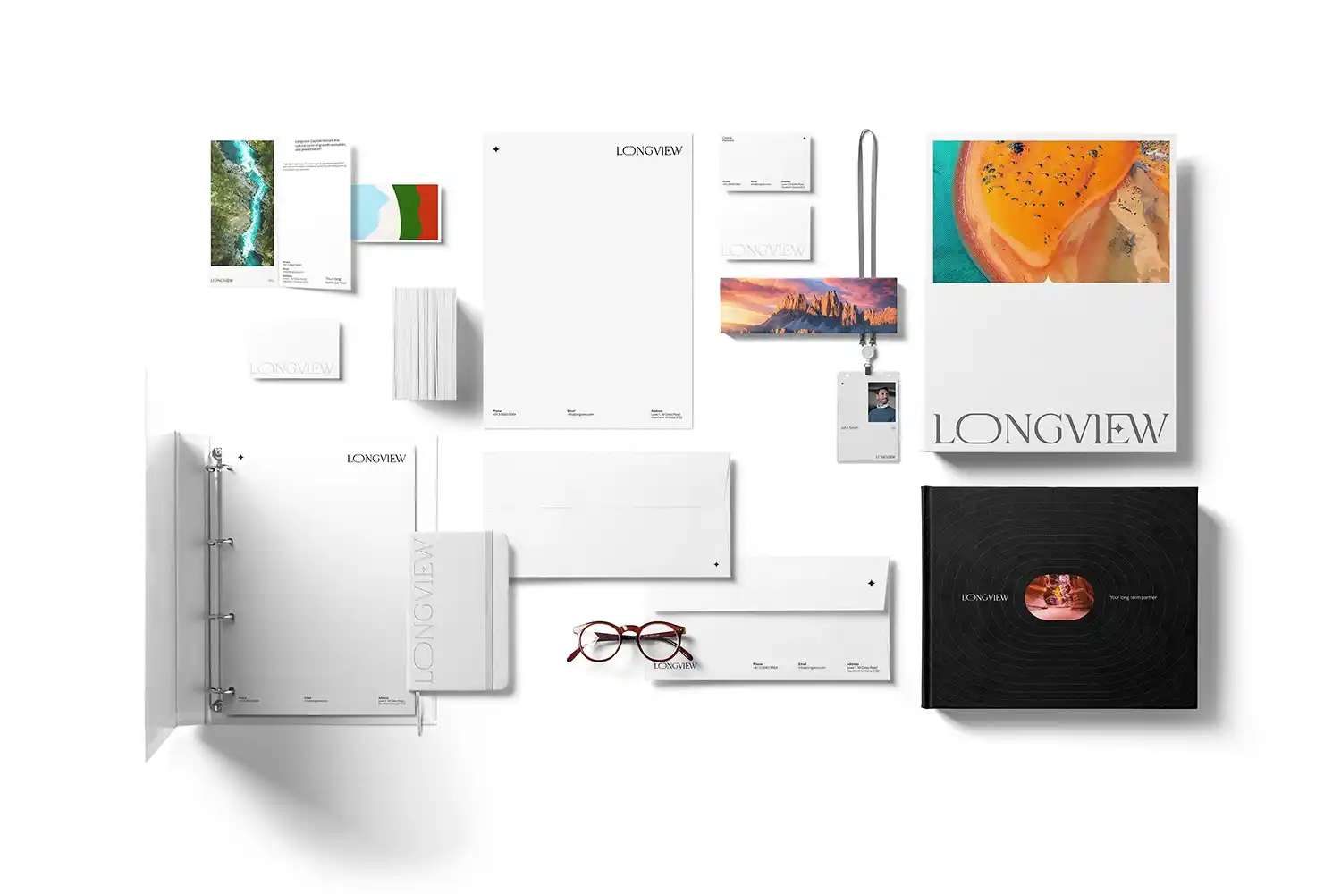
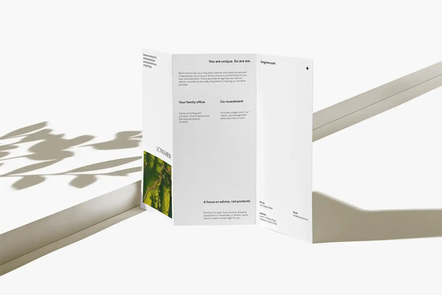
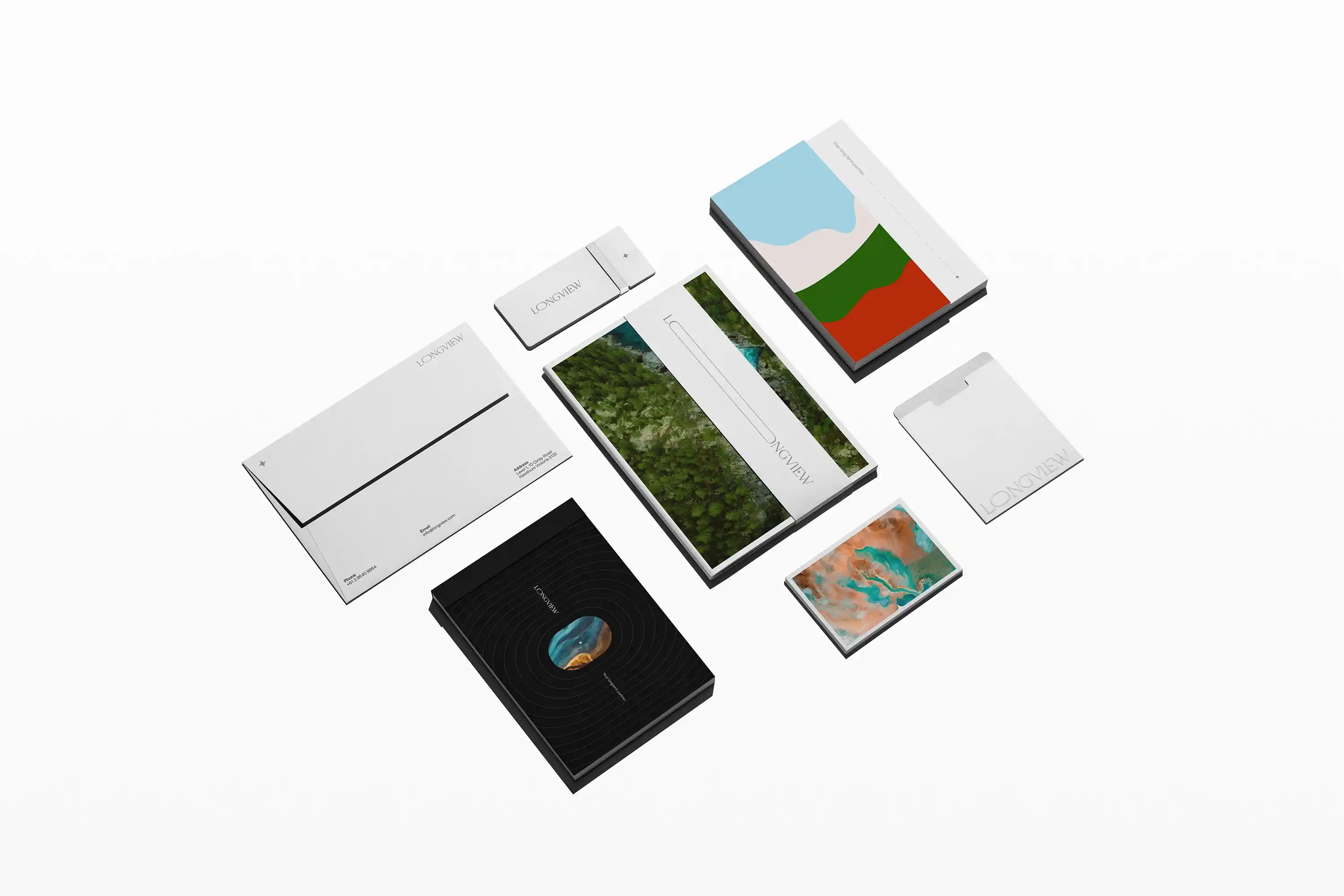
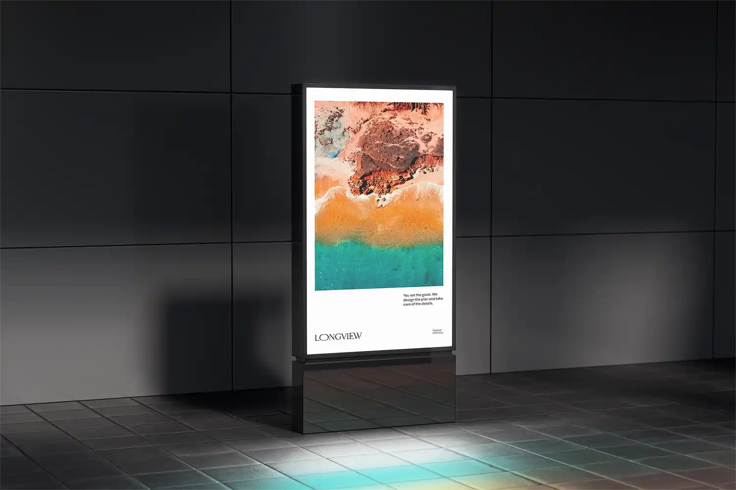
Longview Capital Partners is a wealth management firm based in Australia, committed to long-term financial strategies built on trust, integrity, and personalized client relationships.
Their client-first approach centers on offering adaptable, strategic guidance that evolves with individual life goals, ensuring enduring financial wellbeing across generations.
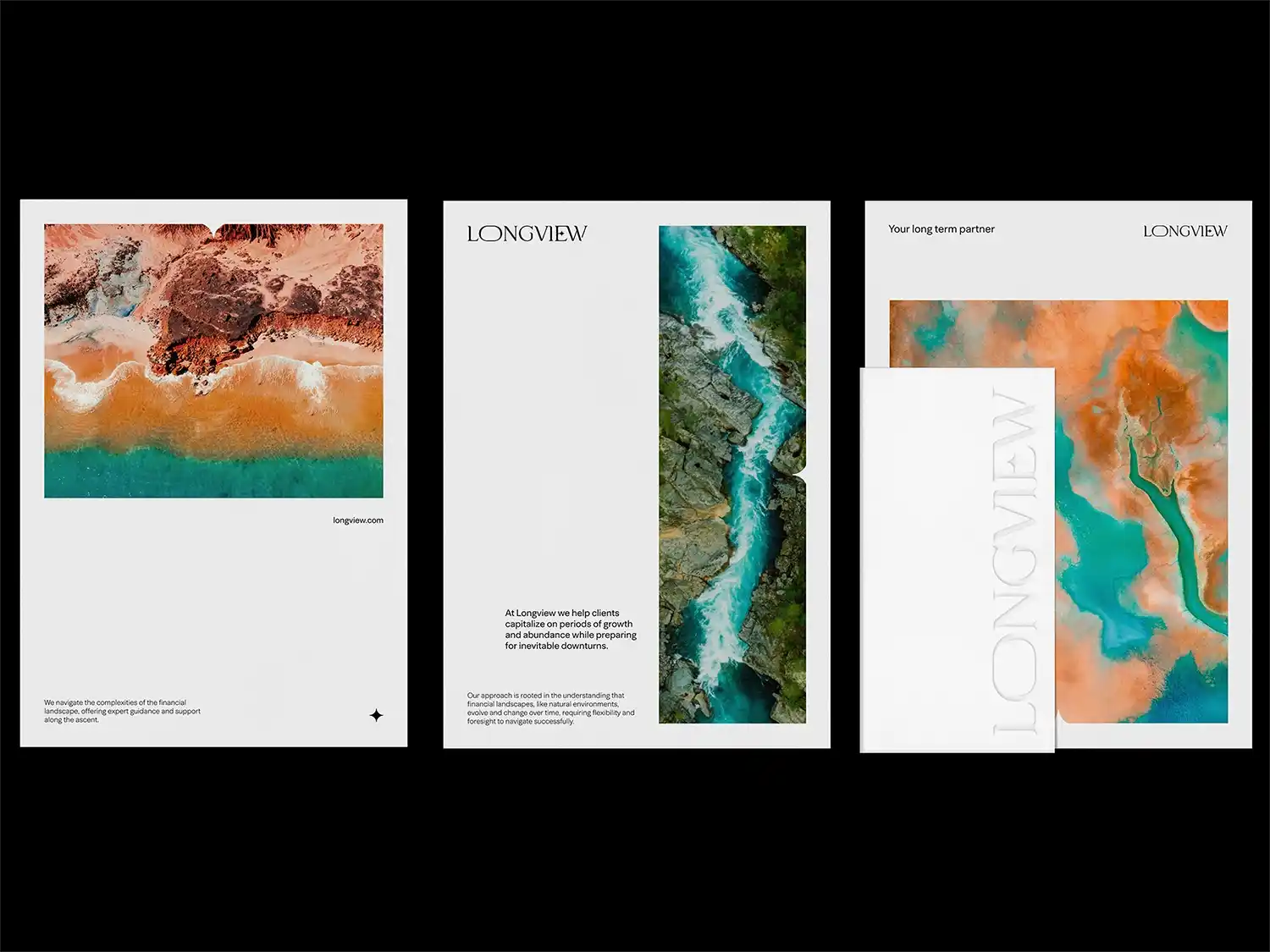
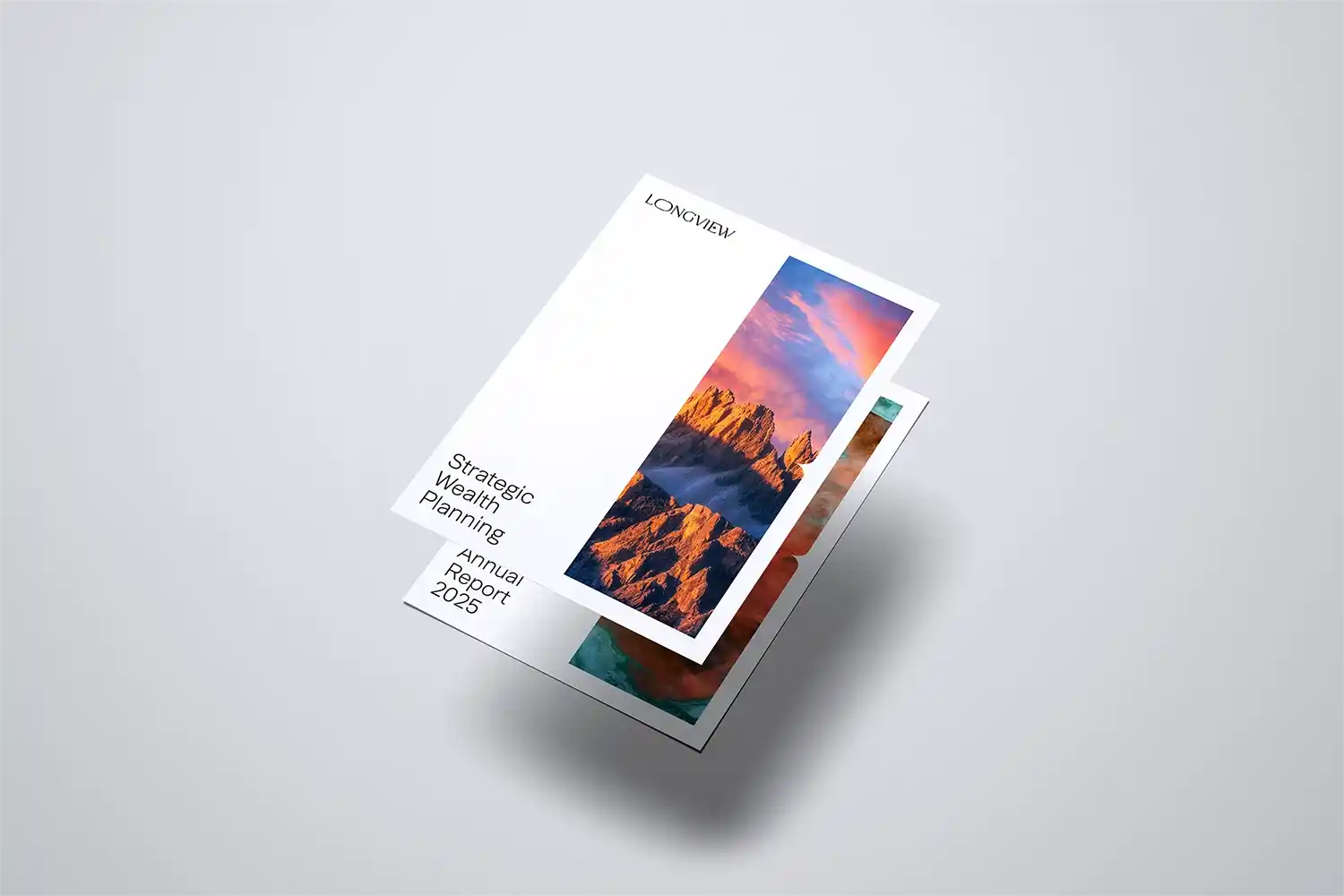
Creating a visual identity for Longview required expressing these values without resorting to corporate clichés. The challenge was to craft a brand that feels both professional and approachable, capturing the firm's balance of grounded financial expertise and forward-thinking vision.
The identity needed to convey sophistication while remaining deeply personal and accessible. Inspired by Australian landscapes, the final brand design uses organic shapes, earthy tones, and minimalist layouts to reflect natural longevity, stability, and clarity.
The visual language evokes peace and purpose, reinforcing Longview’s philosophy of thoughtful, long-term planning. It’s a refined, modern identity that feels distinctly Australian and instills confidence in clients navigating complex financial journeys. A bold aspect brings a sense of quiet strength and conviction, subtly challenging the norms of traditional financial branding without losing trust or professionalism.
This infusion of boldness adds visual contrast and strategic tension, balancing serenity with confidence. It communicates that Longview is not only grounded and dependable but also forward-looking and unafraid to chart a unique course in the financial landscape.
Brand Identity
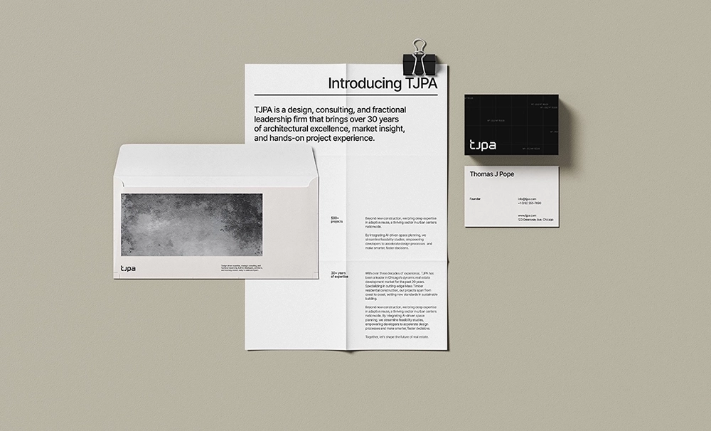
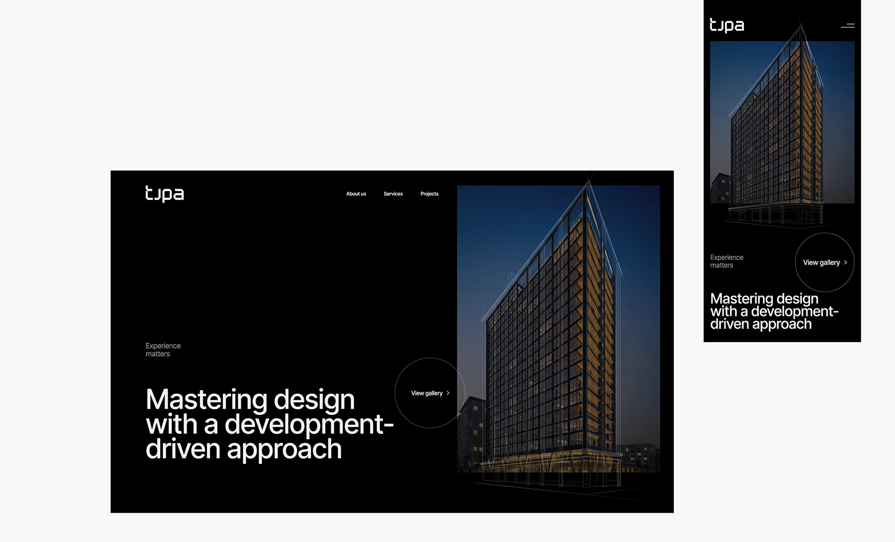
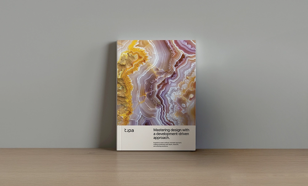
TJPA
Chicago, USA
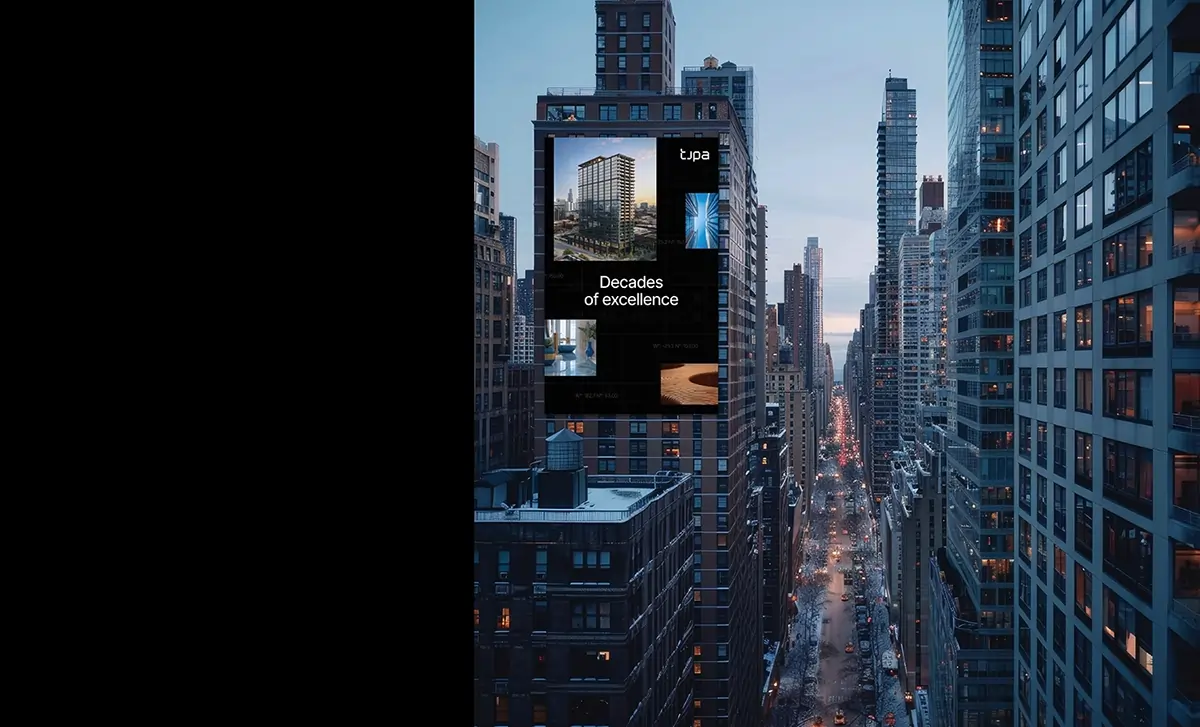
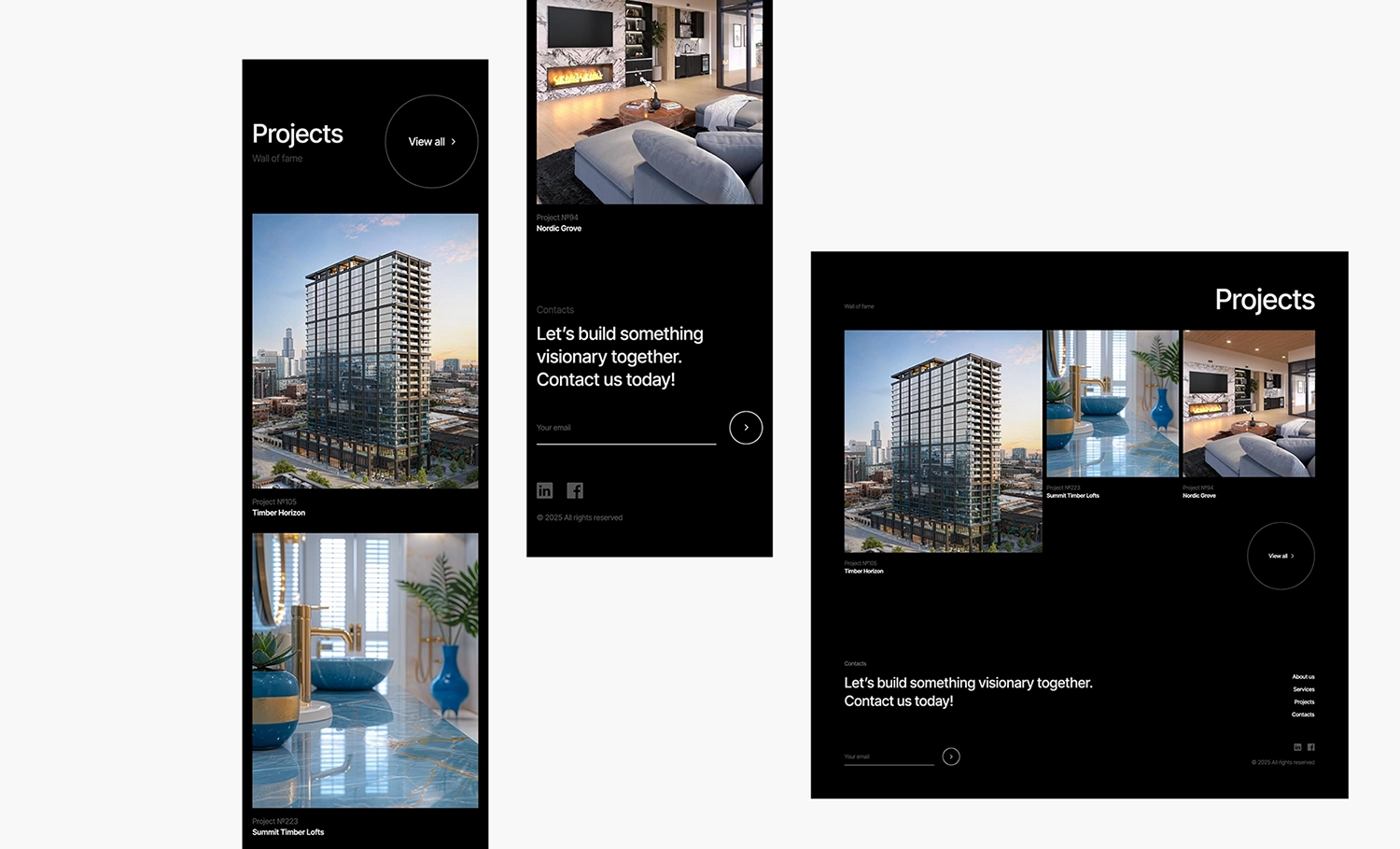
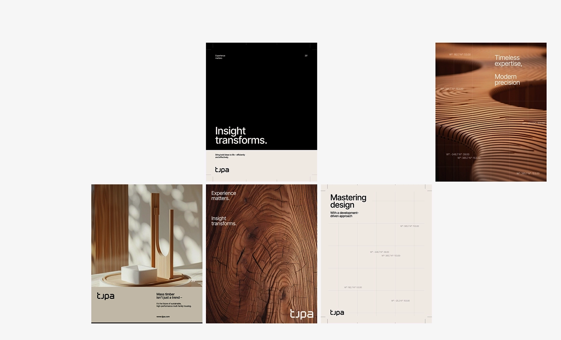
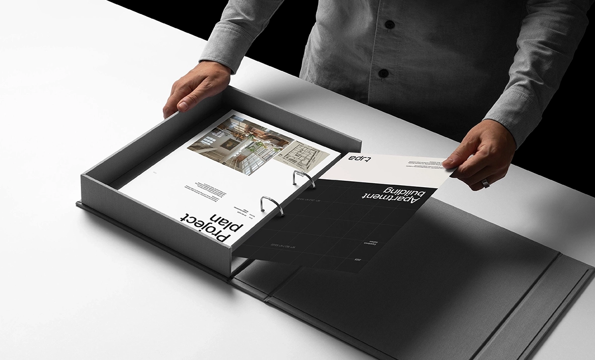
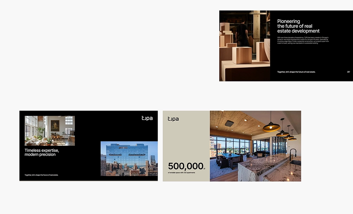
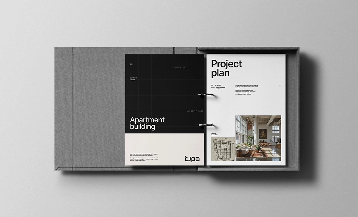
TJPA is a Chicago-based consulting firm that brings a unique blend of design expertise, technical insight, and strategic leadership to the built environment. The firm specializes in architectural visioning, conceptual design, developer liaison services, and fractional leadership, offering a comprehensive, end-to-end approach to project delivery that bridges the gap between creative ambition and real-world execution.
With more than 30 years of industry experience, the TJPA team has led a wide array of multidisciplinary projects across the United States, collaborating with developers, architects, municipalities, and institutional partners. Their portfolio includes innovative work in mass timber construction, adaptive reuse of historic structures, large-scale multifamily housing, hospitality environments, commercial developments, and student living communities.
The challenge was to craft a brand identity that effectively communicates TJPA’s core strengths, design excellence, strategic leadership, and innovation, while remaining approachable to both seasoned industry professionals and those unfamiliar with architectural services.
The messaging had to be clear, compelling, and adaptable across diverse contexts, without diluting the firm’s positioning.
The final identity achieves this through a flexible design system that blends industrial aesthetics with mid-century modern influences and sleek minimalism. The result is a high-end, contemporary visual language that feels both refined and accessible. TJPA’s digital presence reinforces this positioning with tailored content for developers, architects, and property owners, ensuring the brand resonates with a broad and varied audience.
Brand Identity
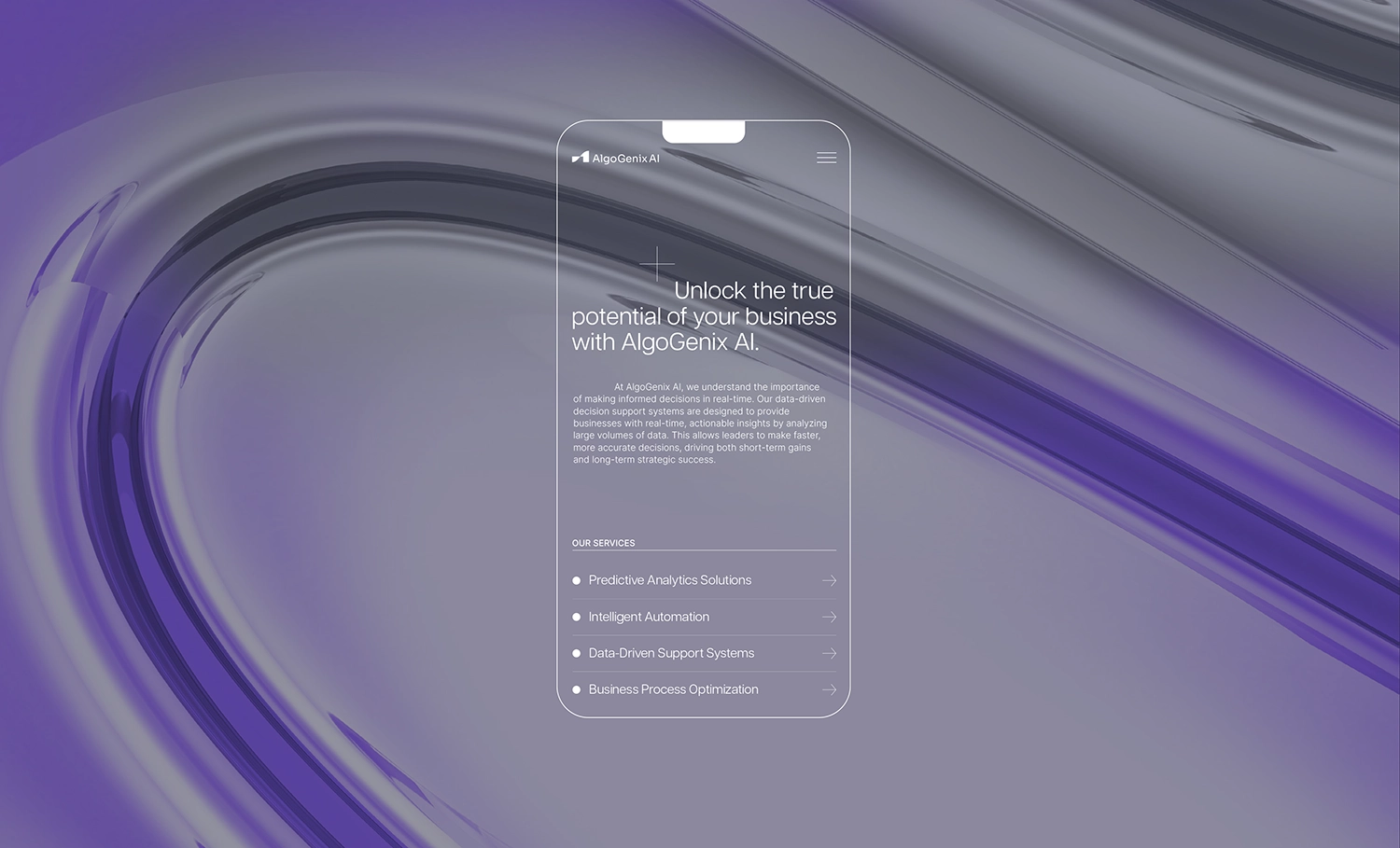
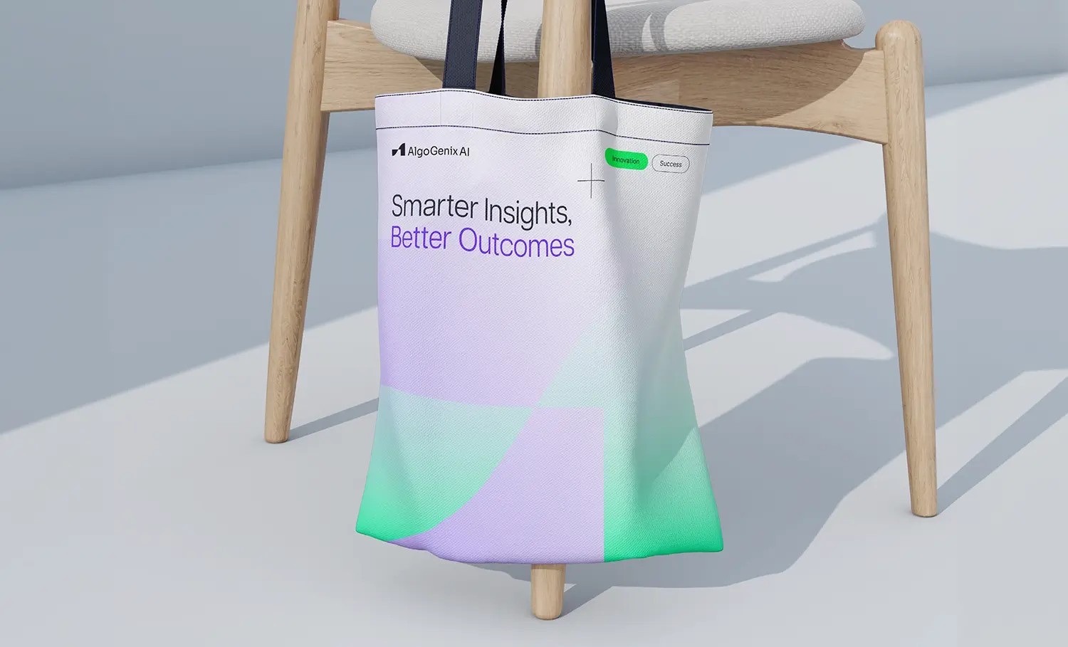
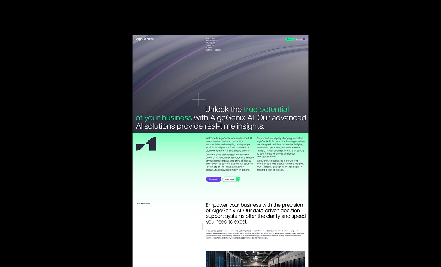
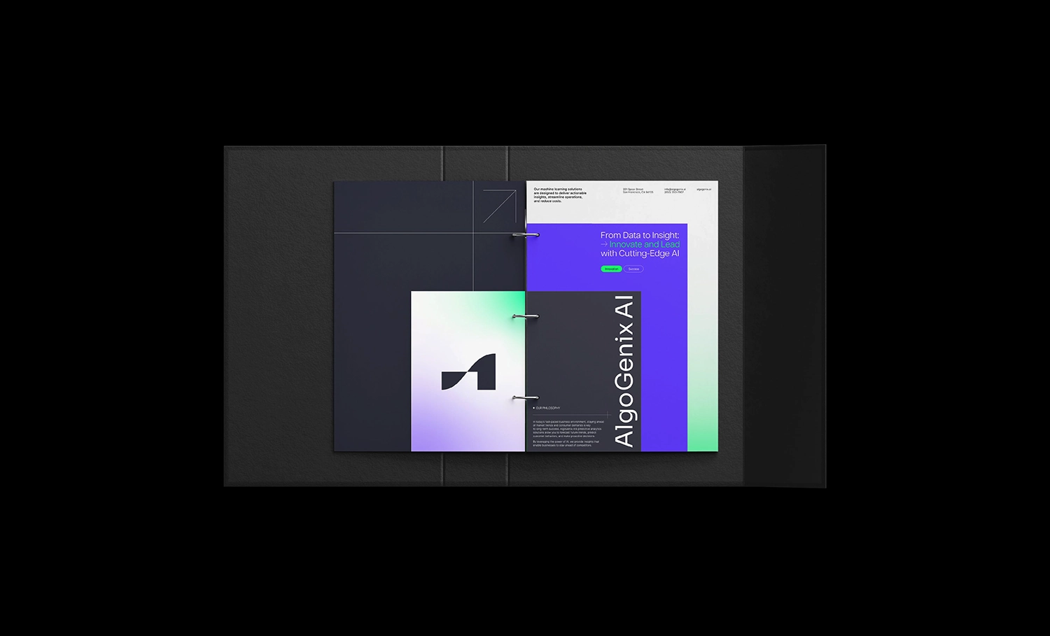
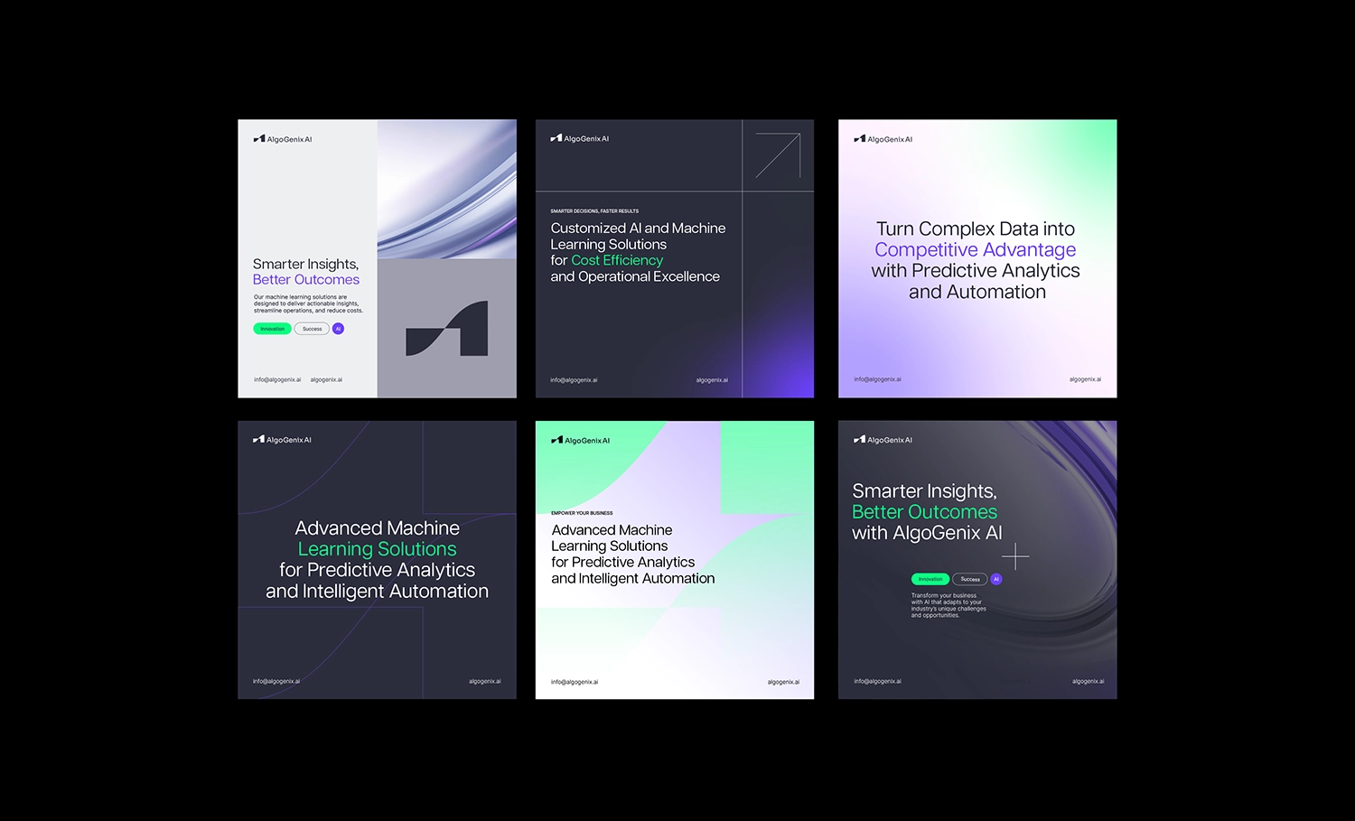
AlgoGenix AI
Florida, USA
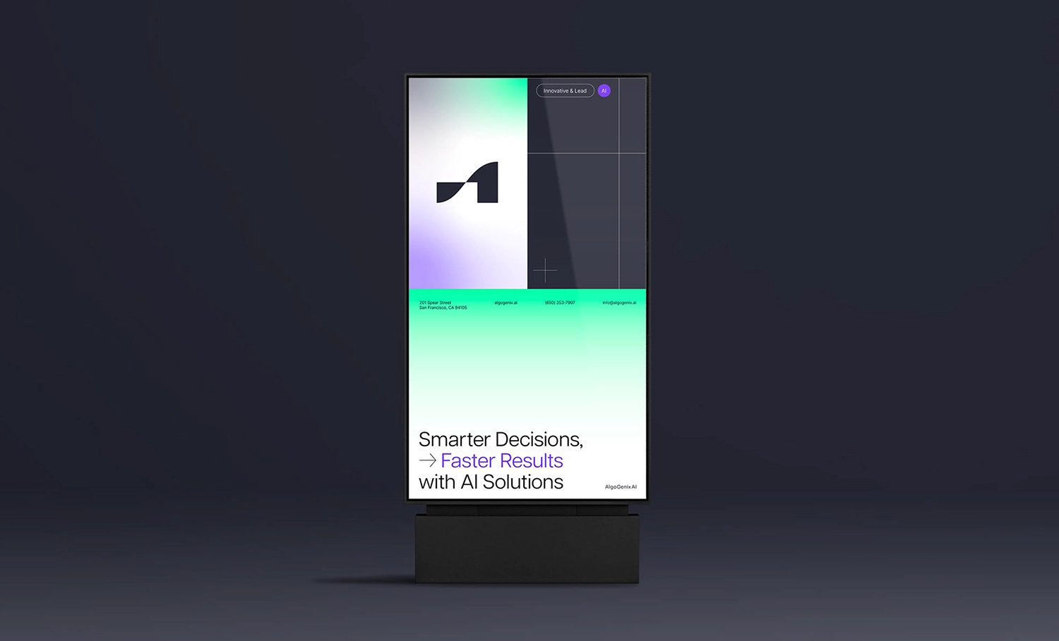
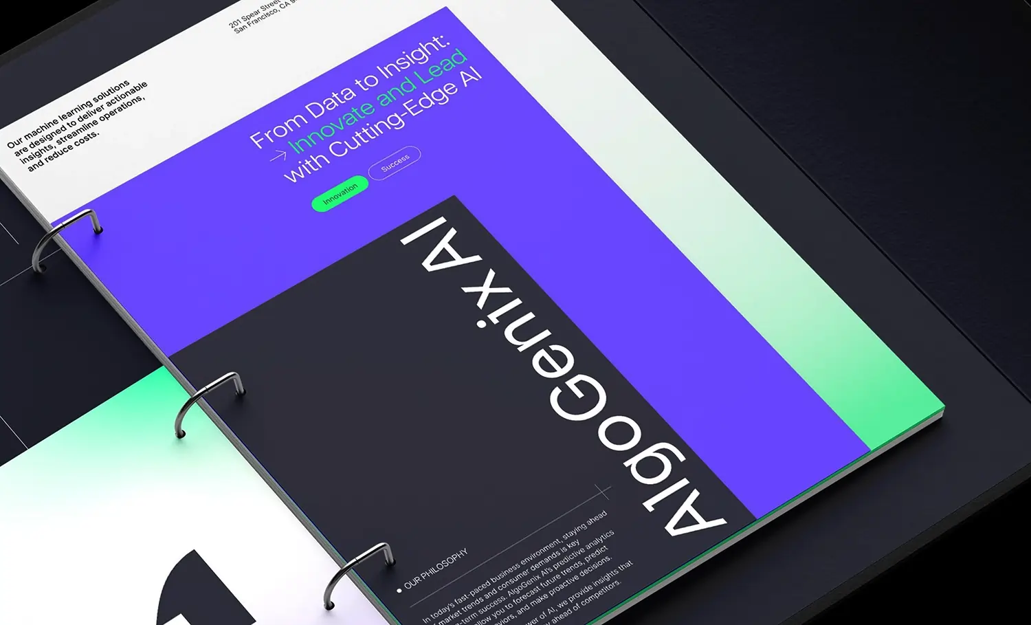
AlgoGenix AI is a future-focused technology company at the forefront of innovation in artificial intelligence and machine learning. Specializing in cutting-edge, data-driven solutions for a wide range of industries, including healthcare, finance, logistics, and manufacturing, the company empowers clients to harness the transformative power of AI to solve complex problems, improve efficiency, and unlock new growth opportunities.
From strategic consulting to custom algorithm development and seamless deployment, AlgoGenix offers a comprehensive, end-to-end service model. Every engagement is carefully tailored to the unique characteristics of the client’s industry, the nuances of their data, and their specific business goals.
In today’s increasingly saturated AI market, where many companies offer similar promises around innovation, scalability, and automation, true differentiation has become a significant challenge. Many providers focus solely on technical complexity, resulting in brands that feel impersonal, overly academic, or disconnected from the real-world concerns of decision-makers, especially those without deep technical backgrounds.
Recognizing this critical gap in the AI landscape, we developed a brand identity designed to bridge the divide between technological sophistication and human-centered communication. The goal was to create a visual and verbal language that would reflect the complexity of advanced artificial intelligence while remaining accessible, engaging, and relatable to both technical and non-technical audiences.
The resulting brand system is built around a design language that blends sleek, futuristic minimalism with a welcoming and emotionally resonant tone. A thoughtfully curated color palette, combining vibrant tones with softer pastels,strikes a balance between energy and calm, suggesting both innovation and approachability. Abstract graphic motifs and streamlined geometric forms are used to subtly represent the layered, multifaceted nature of AI systems, translating intricate concepts into visual elements that feel intuitive and digestible.

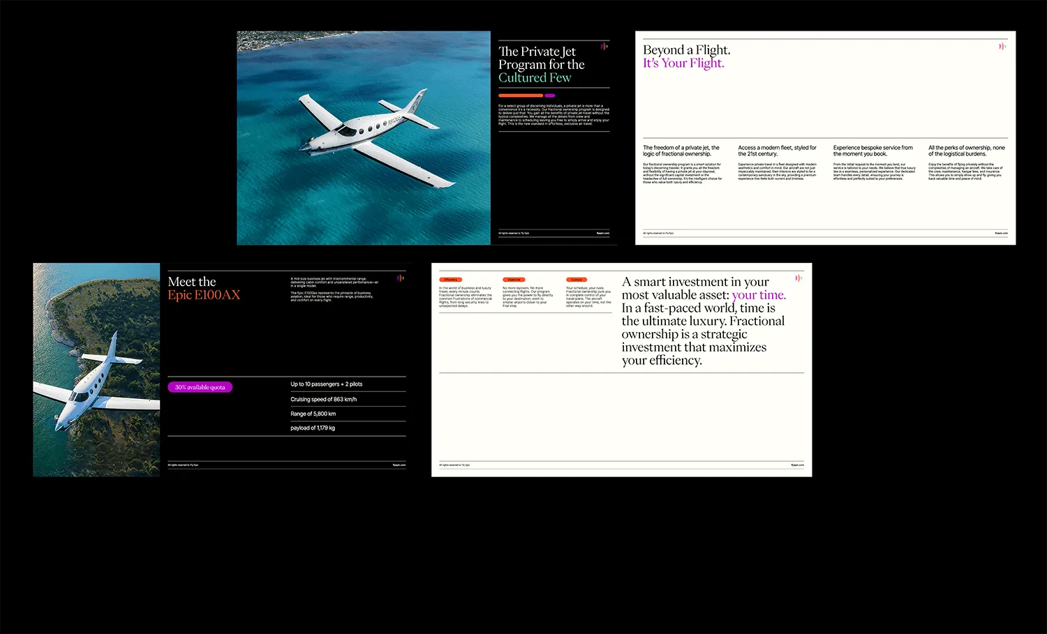
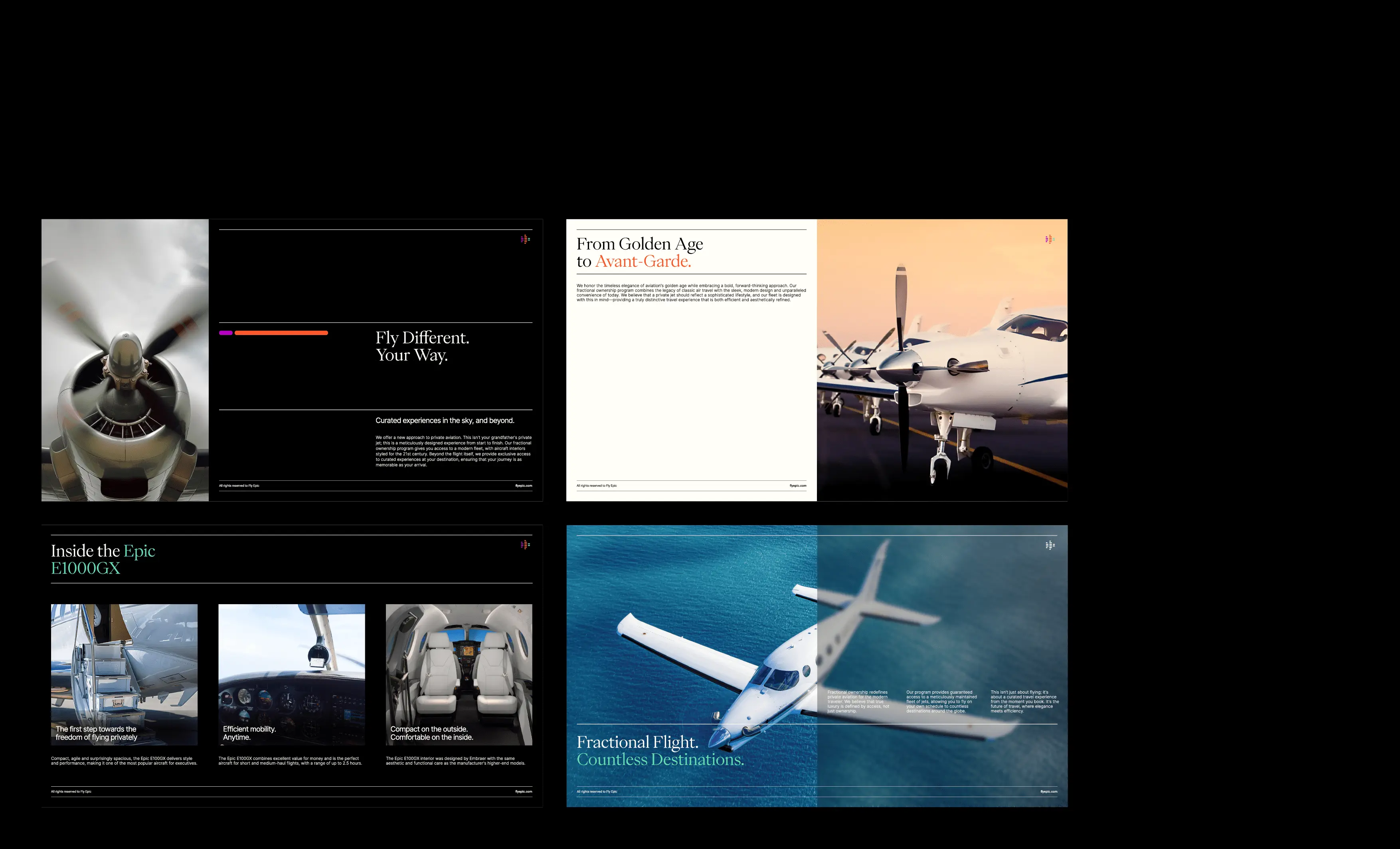
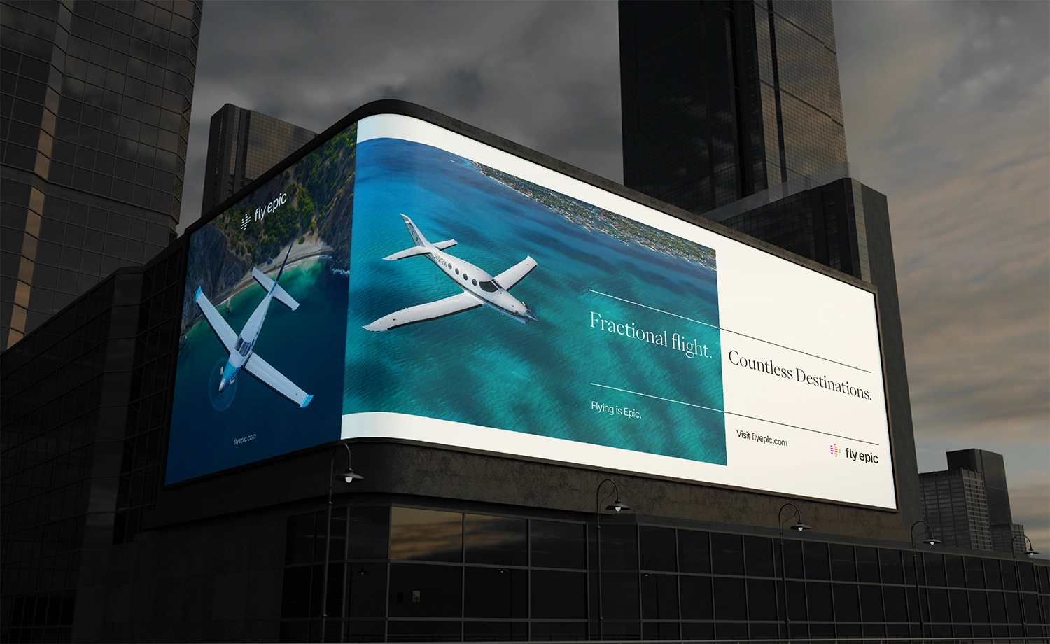
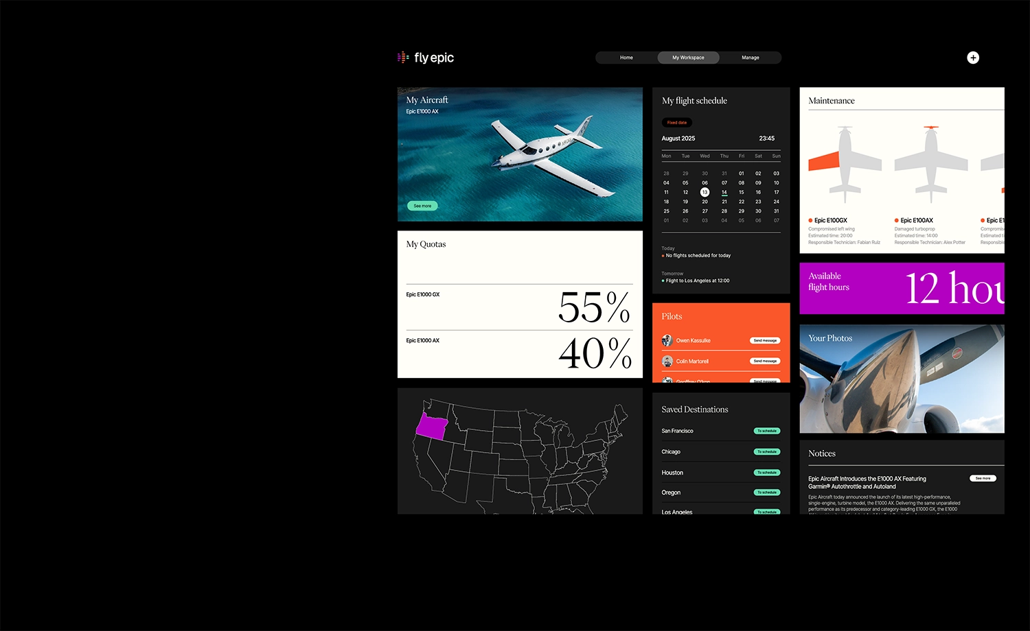

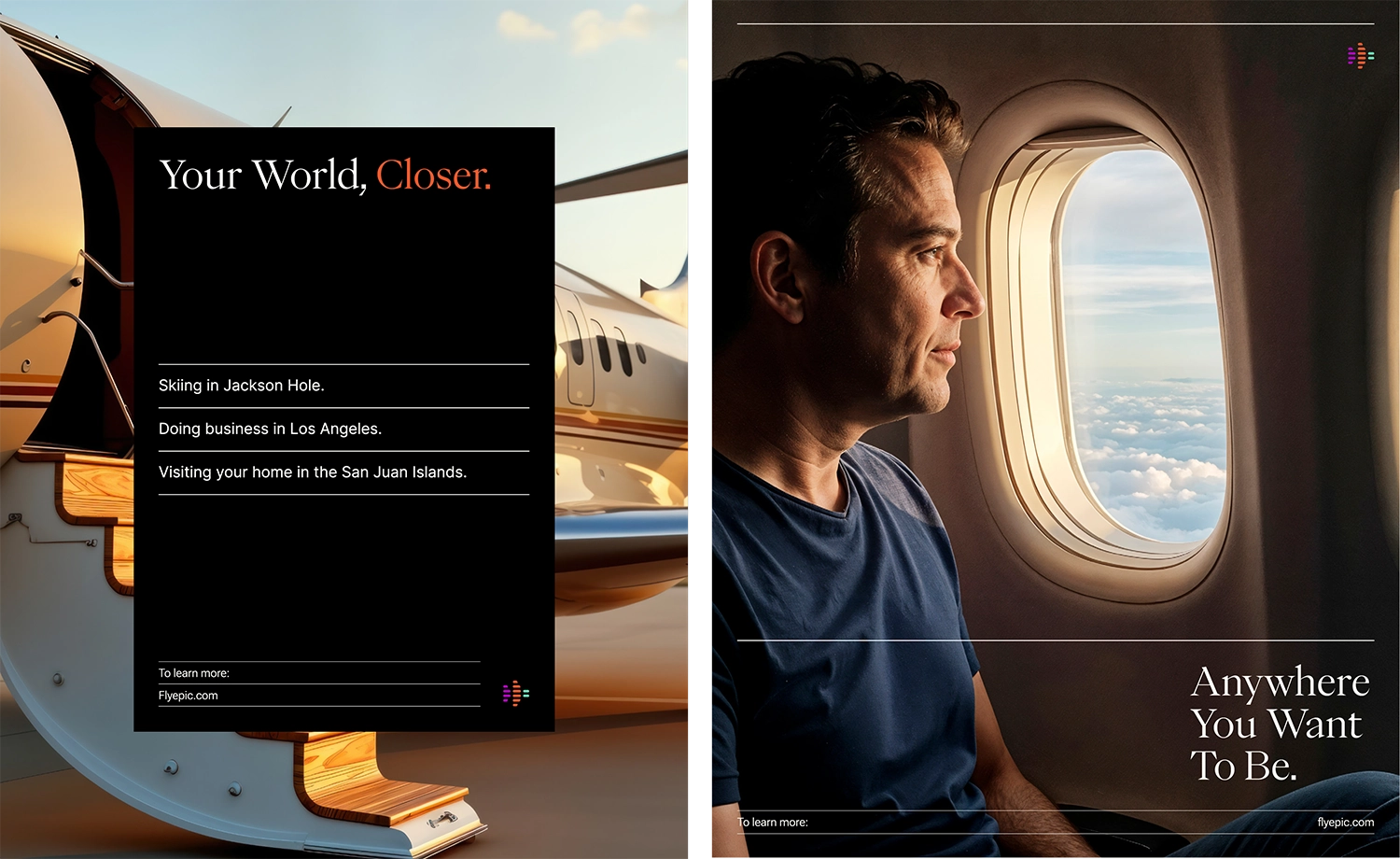
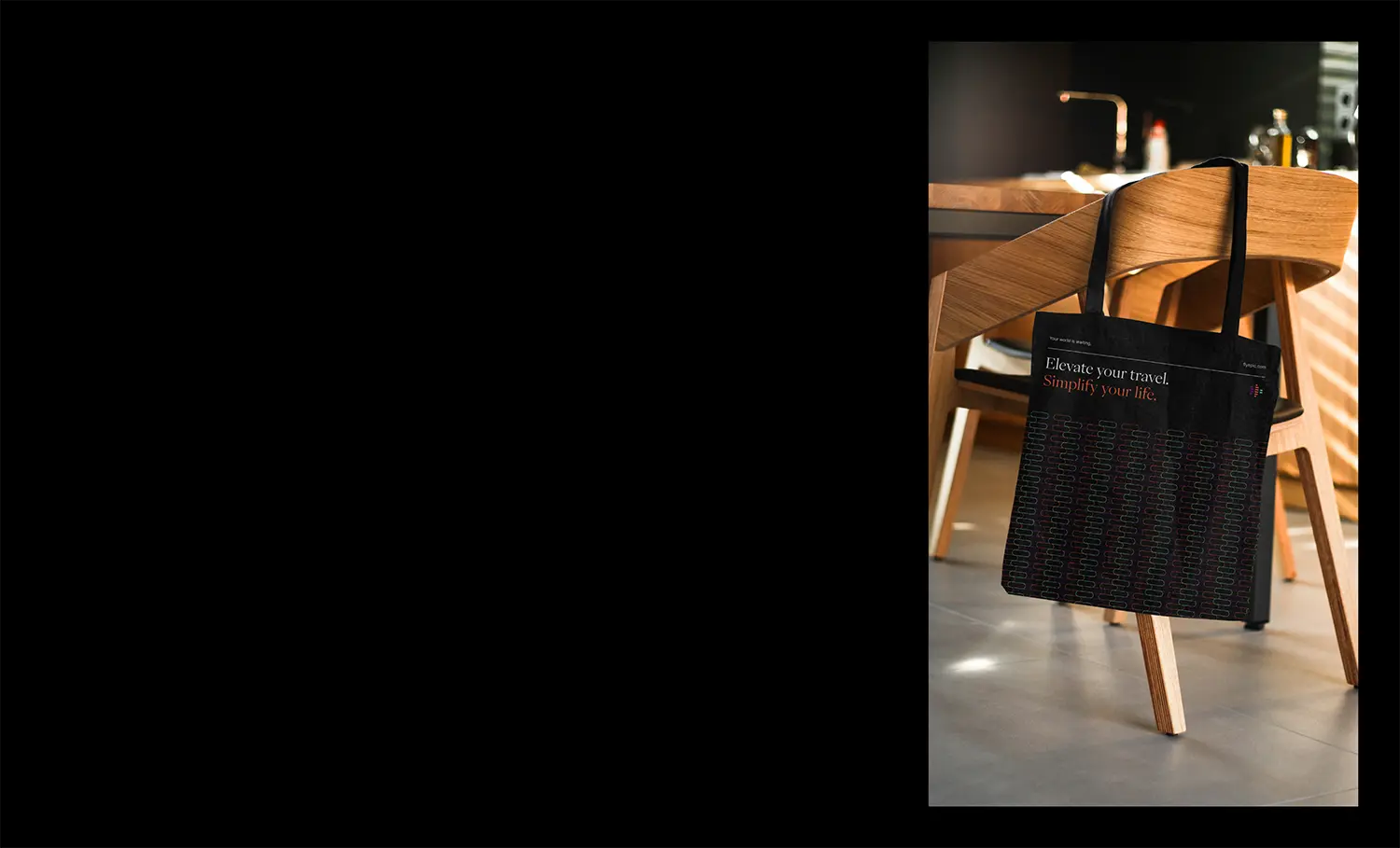
FlyEpic
Oregon, USA
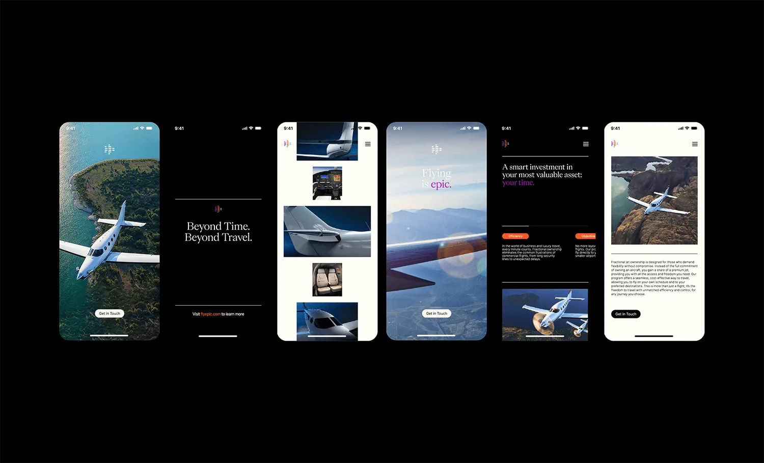
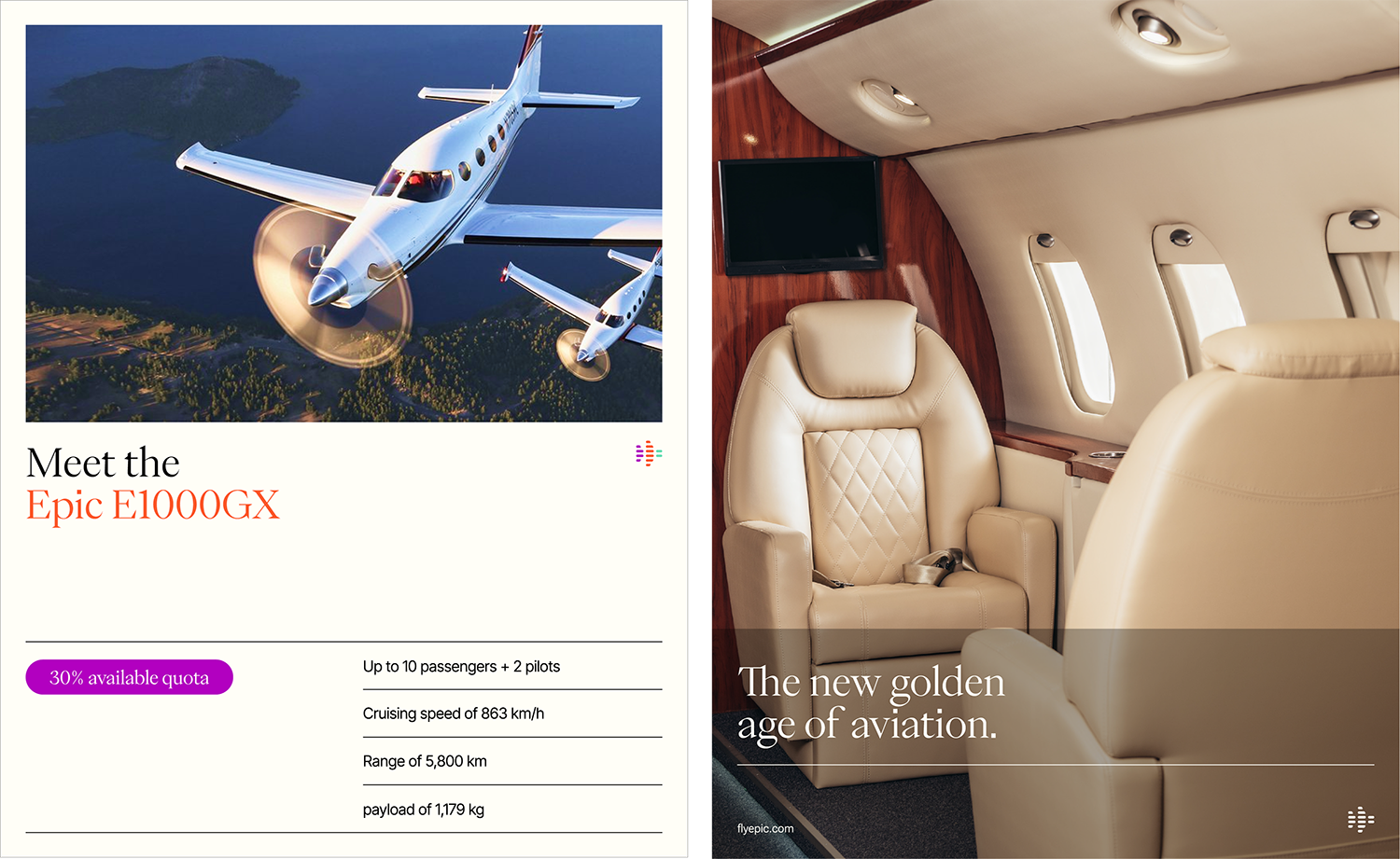
FlyEpic was founded to reimagine the traditionally rigid and status-driven world of private aviation. From its headquarters in Bend, Oregon, the company, led by two young entrepreneurs, draws inspiration from the golden age of flying, blending classic elegance with modern cultural relevance. More than just an aviation brand, FlyEpic offers a lifestyle experience built around design, access, and emotional connection.
Creating a brand identity for FlyEpic came with unique challenges. It needed to break away from the industry’s conservative visual norms without sacrificing professionalism or trust. At the same time, it had to appeal to a new generation of wealth, experience-driven individuals who prioritize culture and conscious living. Positioning the brand as both premium and accessible was key, ensuring that it felt aspirational but not out of reach.
The FlyEpic identity was developed as a bold, lifestyle-centric solution that redefines what a private aviation brand can be. Rather than positioning FlyEpic as a transactional flight service, the brand is elevated into a cultural statement, a symbol of aspiration, individuality, and experience. It speaks not just to where you’re going, but who you are when you get there.
The core of the brand strategy is rooted in emotional resonance. FlyEpic doesn’t sell flights, it sells moments, meaning, and momentum.
The identity taps into the mindset of modern luxury consumers who crave more than status; they seek belonging, narrative, and connection. To meet that demand, the design system was built to communicate with intention and depth. Every visual and verbal element, from typography and color palette to tone of voice and digital interface, was crafted to elicit a feeling, not just recognition.
Visually, the identity strikes a deliberate balance between timeless sophistication and youthful energy. It blends refined aesthetics with bold, contemporary design cues, signaling both heritage and innovation.
The system is highly modular, ensuring adaptability across touchpoints, from app interfaces and aircraft interiors to social campaigns and lifestyle merchandise, without losing cohesion or diluting the brand’s essence. What sets FlyEpic apart is its ability to fuse aviation credibility with cultural fluency.
The brand doesn’t just speak the language of private travel; it speaks the language of its audience. It reflects a future-forward ethos that is inclusive, design-driven, and emotionally intelligent, qualities that resonate with a new generation of discerning, values-aligned travelers.
In doing so, FlyEpic emerges not only as a leader in private aviation but as a movement that reimagines luxury through the lens of culture, experience, and identity. It’s a brand built for those who fly not just to arrive, but to live exceptionally.
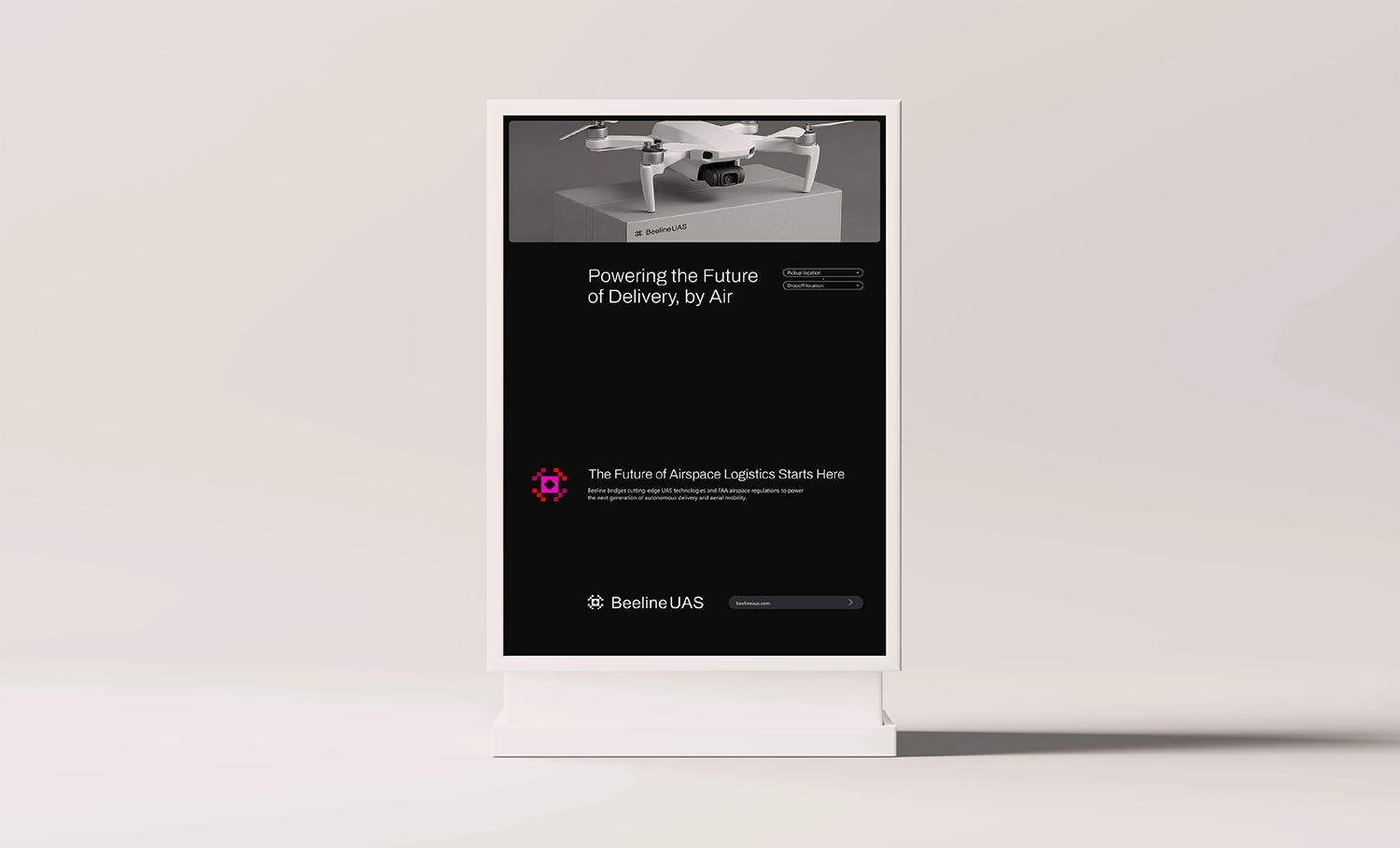
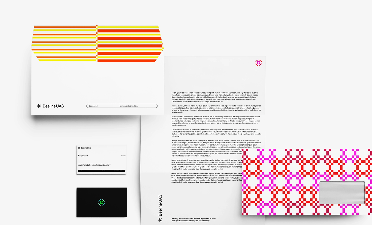
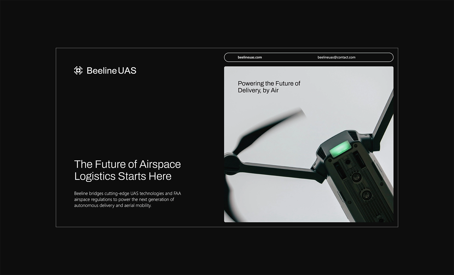
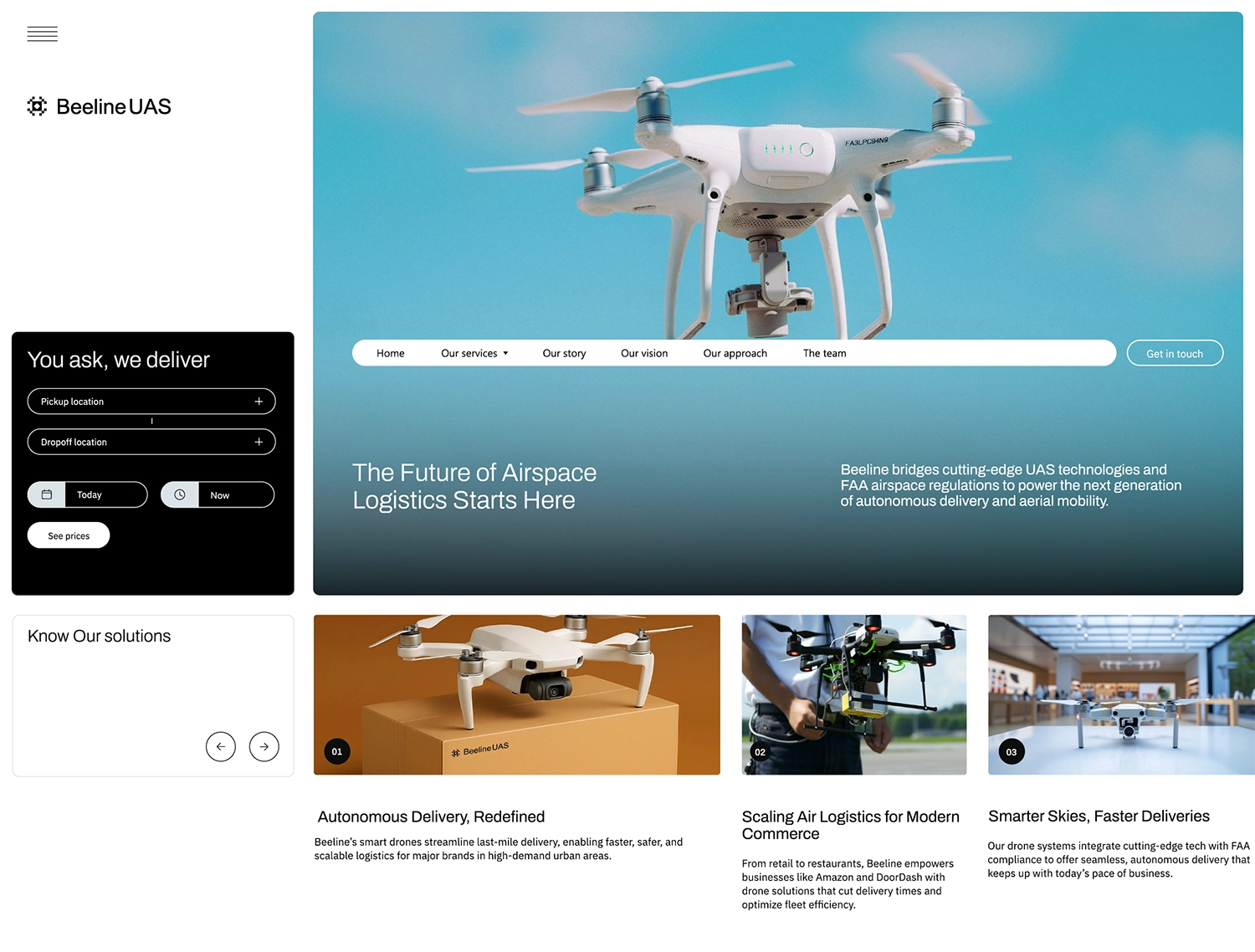
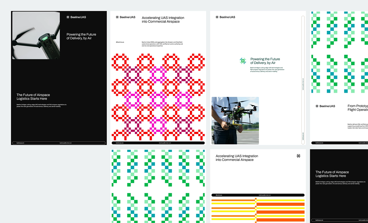
Beeline
Oregon, USA
Beeline is a B2B operations firm that integrates emerging unmanned aerial systems (UAS) into the national airspace, supporting major platforms like Amazon, DoorDash, and Uber Eats by bridging the gap between innovation and FAA compliance.
It stands out for its FAA air carrier certificate and deep regulatory expertise, offering scalable, drone-agnostic delivery solutions. With a mission to make drone delivery safe, affordable, and accessible nationwide, Beeline is driven by core values of kindness and creativity.
Establishing Beeline’s brand identity required balancing the innovative nature of UAS technology with the professionalism demanded by aviation regulation. The challenge lay in communicating a clear, differentiated value proposition in a highly technical space, while emphasizing Beeline’s drone-agnostic, scalable operations model.
The brand also needed to reflect the founder’s compelling journey without relying solely on it, and convey approachability in an industry often marked by formality, achieved by embedding its core values of kindness, creativity, and grit into a flexible, credible, and forward-looking identity.
Beeline’s brand identity strikes a deliberate balance between aviation professionalism and forward-thinking innovation, positioning the company as a strategic, drone-agnostic partner focused on outcomes like efficiency and compliance. The visual and verbal language blends stability with energy, clean layouts, bold accents, and accessible messaging, while maintaining a polished yet approachable tone. To differentiate the brand in a future-facing market, a touch of eccentricity was introduced through custom prints and playful patterns, adding visual delight and signaling Beeline’s smart, capable, and distinctly human character.
We craft high-performing creative assets and strategic toolkits designed to drive impact,
scale, and value at every stage of digital transformation.
What do you want to get designed?


Branding
In an increasingly crowded and fast-paced digital landscape, a well-crafted brand identity has become a critical strategic asset. Beyond aesthetics, it shapes perception, builds trust, and creates meaningful differentiation. When thoughtfully executed, it enables a brand to cut through the noise, establish emotional resonance, and sustain long-term relevance through loyalty, recognition, and elevated positioning.
At AMca, this philosophy informs everything we do. With more than 25 years of experience across a broad spectrum of industries, we understand that every business is inherently distinct, shaped by its own challenges, ambitions, and audiences.
Our expertise lies in crafting brand identities that extend far beyond visual appeal. Each system we develop is underpinned by rigorous research, cultural insight, and business strategy, ensuring that the outcome is not only aesthetically refined but also deeply functional and built to perform.
We’ve developed a specialization in building and supporting multi-functional brand ecosystems: dynamic, scalable frameworks that evolve alongside your business while maintaining consistency across platforms, audiences, and experiences.
In an era where surface-level design is often mistaken for branding, we challenge that notion. We design experiences that carry meaning, create resonance, and stand the test of time. Our work prioritizes clarity, cohesion, and strategic intent, resulting in brands that are purpose-driven, culturally attuned, and positioned for long-term growth.
Team Structure:
UX/UI Design
Exceptional UX (User Experience) and UI (User Interface) design are no longer differentiators, they're fundamental to how digital products succeed in the market. As user expectations grow and competition intensifies, the ability to deliver seamless, intuitive, and emotionally resonant experiences has become essential to driving engagement, building trust, and fostering long-term brand loyalty.
At AMca, we view UX/UI not as surface design elements, but as integral components of product strategy. With decades of experience designing for diverse industries and user needs, we understand that effective digital experiences must balance intuitive usability with expressive design. Our approach combines user research, behavioral insights, and design systems thinking to create interfaces that are not only visually engaging but also accessible, responsive, and purpose-driven.
We specialize in building cohesive digital environments that prioritize clarity, reduce friction, and guide users seamlessly toward their goals. From micro-interactions to scalable design systems, every decision is made with the end user in mind. In a landscape where digital products often compete on experience alone, we focus on creating interactions that are not only beautiful but deeply functional, experiences that feel effortless, familiar, and intelligent.
Because at its best, UX/UI isn’t just about how something looks or works, it’s about how it feels. And when done right, it transforms digital touchpoints into lasting impressions.
Team Structure:
Collaterals or Templates
Well-executed marketing collateral is more than a support tool, it’s a foundational extension of your brand and a strategic driver of business growth. Encompassing everything from brochures, whitepapers, and case studies to presentations, reports, and digital assets, these materials serve as critical touchpoints throughout the buyer’s journey. They communicate value, articulate expertise, and provide clarity around products and services, often influencing perception long before direct engagement begins.
At AMca, we view marketing collateral not as one-off deliverables, but as part of a larger system designed to scale. In a fast-paced and competitive landscape, consistency, clarity, and agility are paramount. That’s why we develop templated collateral systems that are both brand-aligned and highly functional, ensuring that your teams can move quickly without compromising quality or cohesion. These systems empower internal teams with ready-to-use frameworks that streamline content creation, preserve visual identity, and maintain messaging integrity across formats and platforms.
When done right, marketing collateral enhances sales effectiveness, builds trust, reinforces brand consistency, and strengthens digital engagement. More than just content, it becomes a tactical brand asset, supporting strategic storytelling, accelerating decision-making, and amplifying the impact of every touchpoint.
Team Structure:
Social Media Templates
In today’s digital-first economy, social media has evolved far beyond a marketing channel, it now functions as the front line of brand communication, reputation management, and audience engagement. It is where a brand’s voice is most visible, where communities are built, and where real-time interactions shape perception.
A strategic, consistent, and authentic presence across social platforms is no longer optional, it’s foundational to how modern brands gain visibility, foster trust, and stay culturally relevant. From storytelling and content creation to audience listening and performance analytics, social media offers a uniquely dynamic space to express brand personality, drive engagement, and create meaningful touchpoints throughout the customer journey.
At AMca, we approach social media as a living extension of your brand ecosystem. We design content frameworks and scalable systems that balance consistency with flexibility, allowing your brand to show up with clarity and confidence, regardless of platform or audience. Whether amplifying campaigns or nurturing everyday interaction, our goal is to turn social media into a powerful strategic asset that informs, inspires, and builds lasting relationships.
Team Structure:
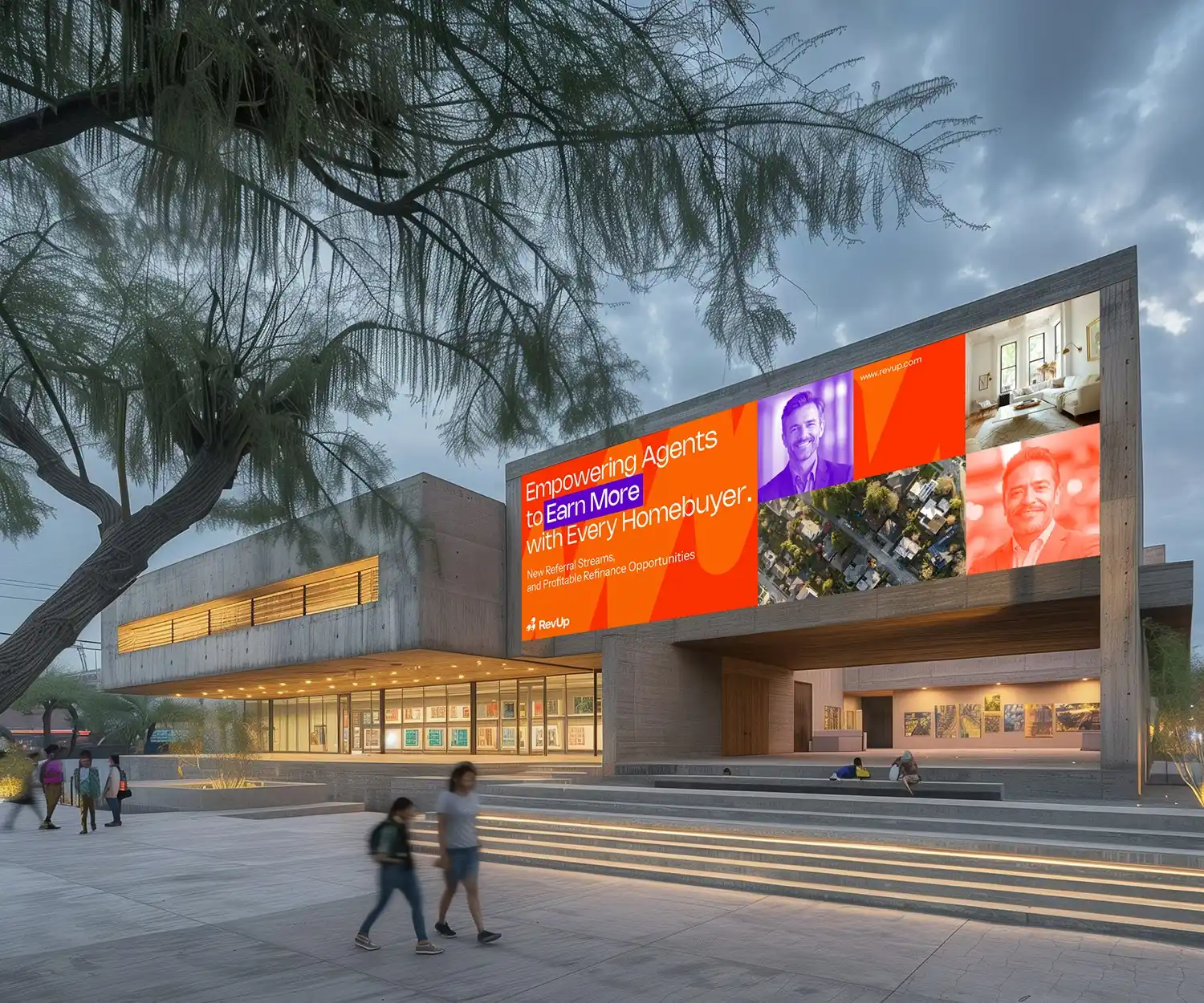
Company Name
NY State, USA
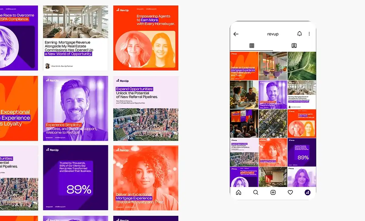
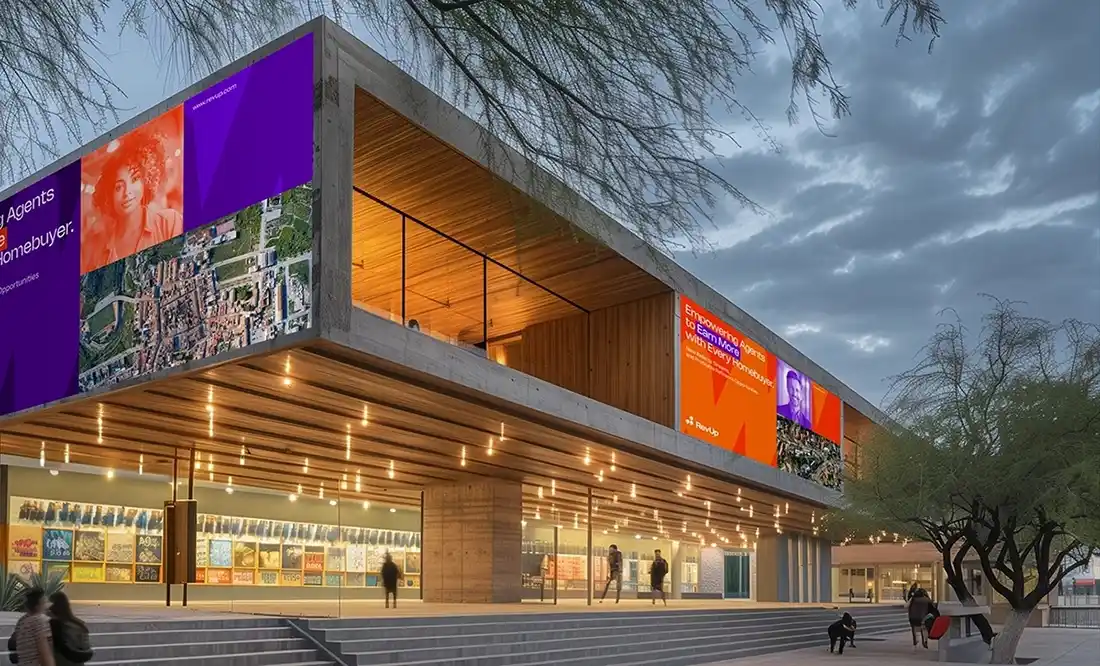
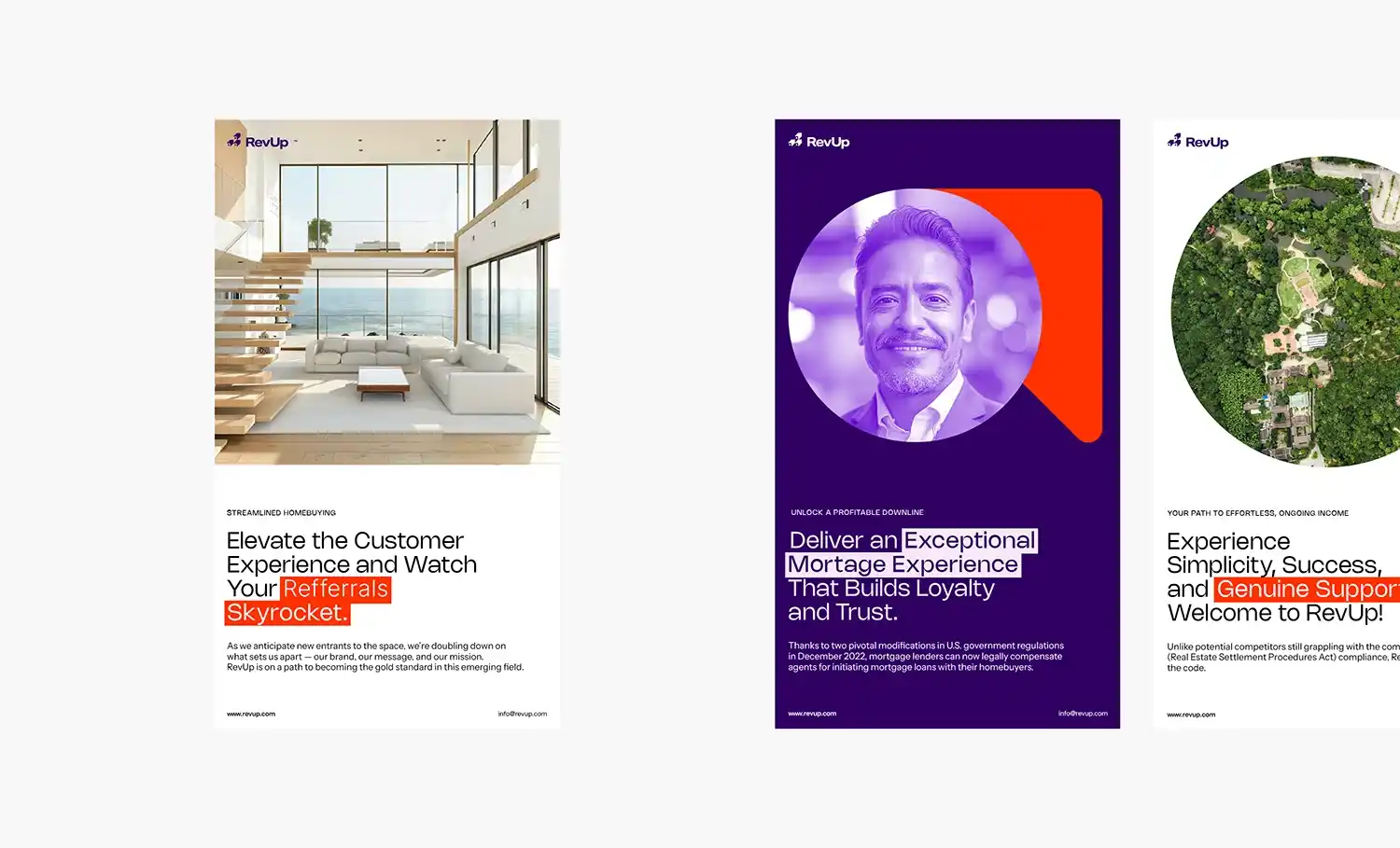
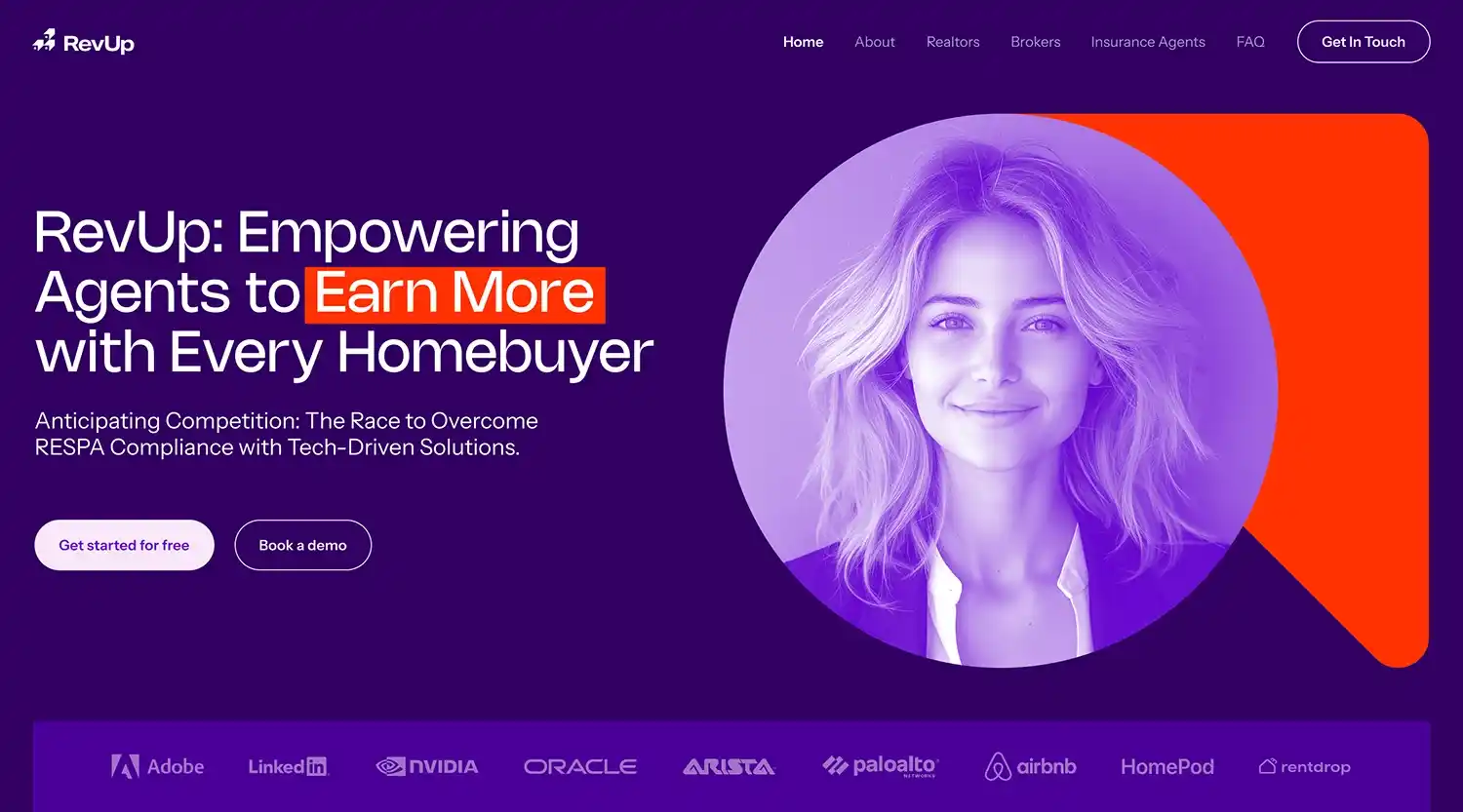
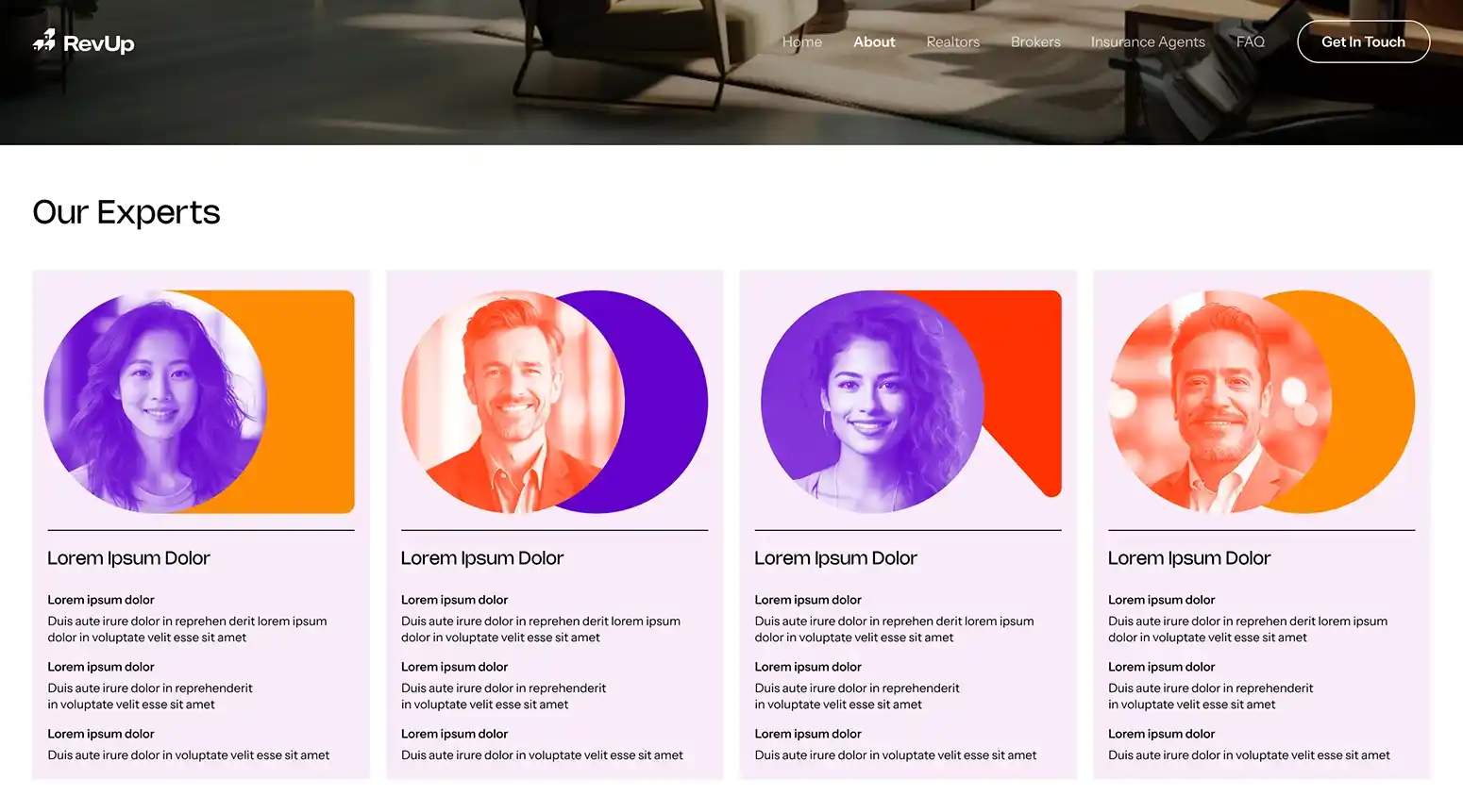
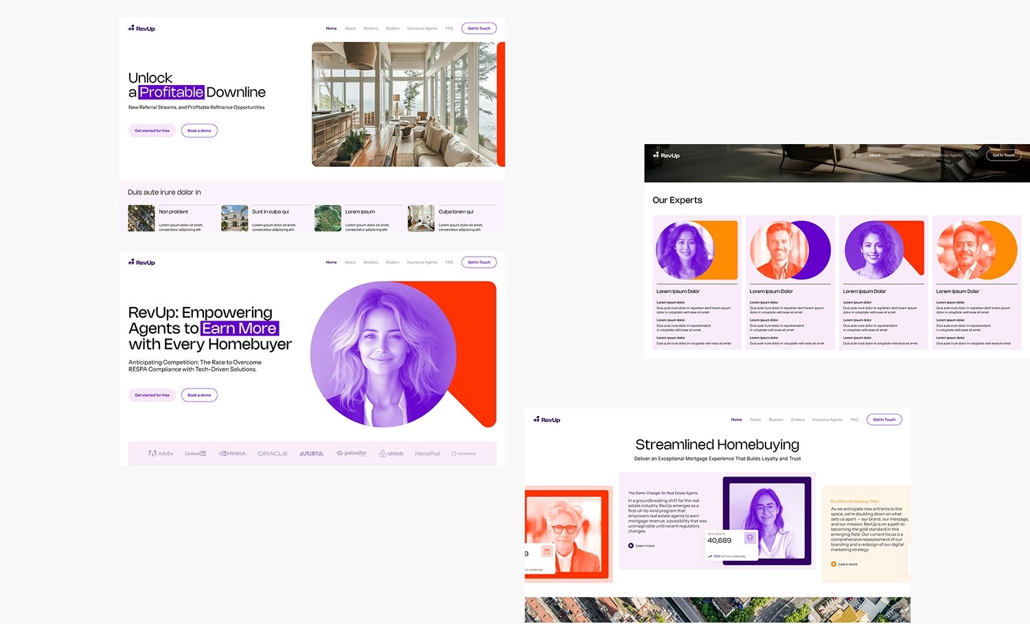
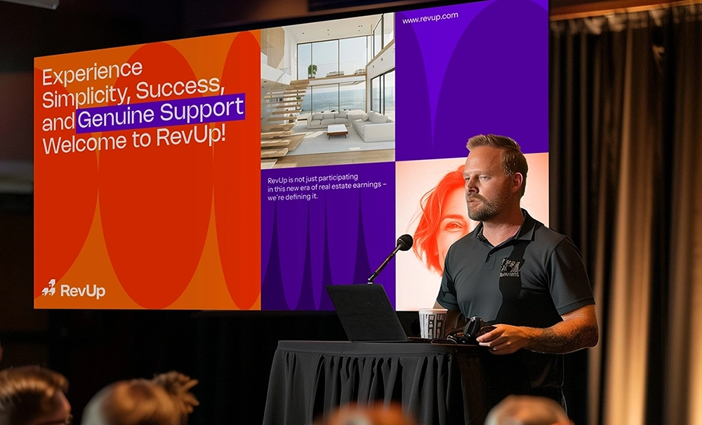
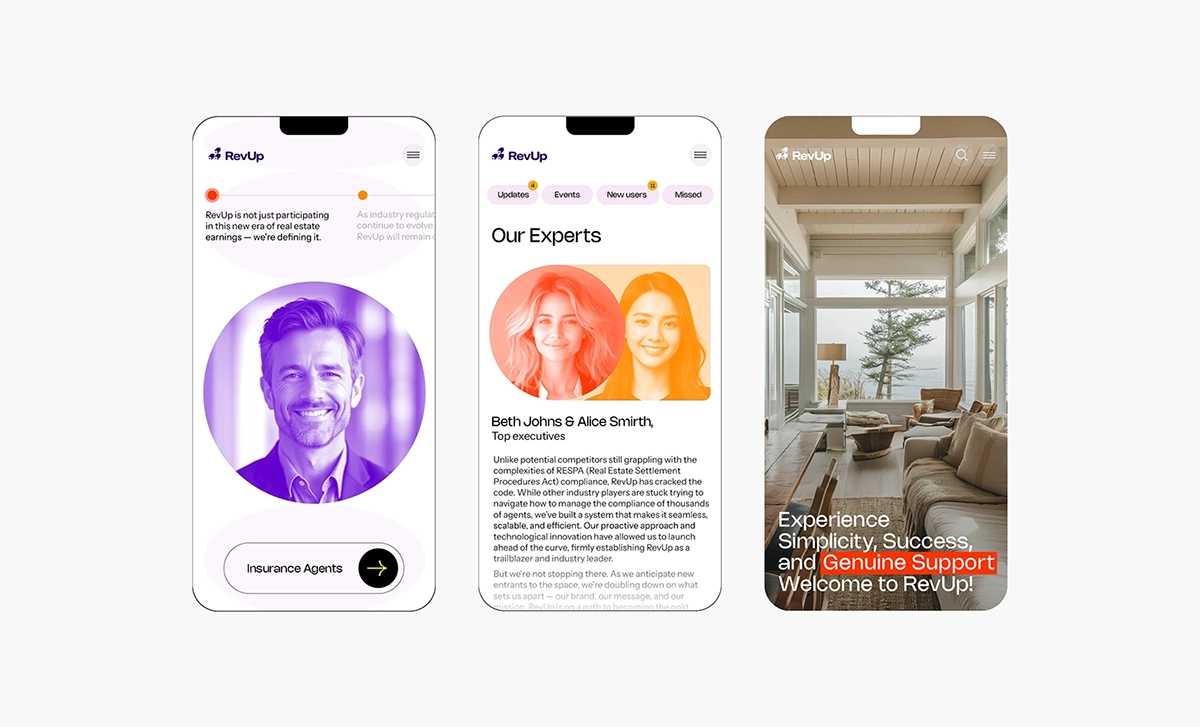
RevUp is a mortgage revenue platform designed to help real estate agents, teams, and brokerages unlock a new, fully compliant income stream. By leveraging regulatory changes enacted in December 2022, RevUp enables industry professionals to participate in mortgage revenue in accordance with RESPA and other federal guidelines, offering a model that is as innovative as it is unprecedented.
As RevUp prepared to expand into the New York market, it faced a critical moment of transformation. While the platform had already established itself as a first mover in this space, it now needed a brand identity that could reinforce its leadership, inspire trust in a highly regulated industry, and clearly communicate its value proposition to a growing and diverse audience.
Led by Andrea, AMca partnered with the RevUp team to evolve the brand strategically and visually. The challenge was to strike a thoughtful balance: capture the energy and disruptive spirit of the platform, while projecting the clarity, professionalism, and credibility required for adoption at scale.
The resulting identity is bold, dynamic, and future-focused. A refined and energetic color palette communicates momentum and trust, while contemporary typography and clean visual elements create a sense of sophistication and accessibility. The brand system is designed to be flexible and intuitive, supporting a range of digital and print applications without losing its core essence.
Equally important was the need for messaging and design to demystify a complex offering. The updated brand prioritizes clarity and confidence, simplifying communications while elevating the product’s credibility in a space often clouded by compliance concerns.
By reimagining its visual and strategic presence, RevUp is now positioned not just as a platform, but as a catalyst for change within the real estate and mortgage industries. The brand reflects its mission to empower agents through innovation, while maintaining the trust and integrity essential to long-term industry transformation.
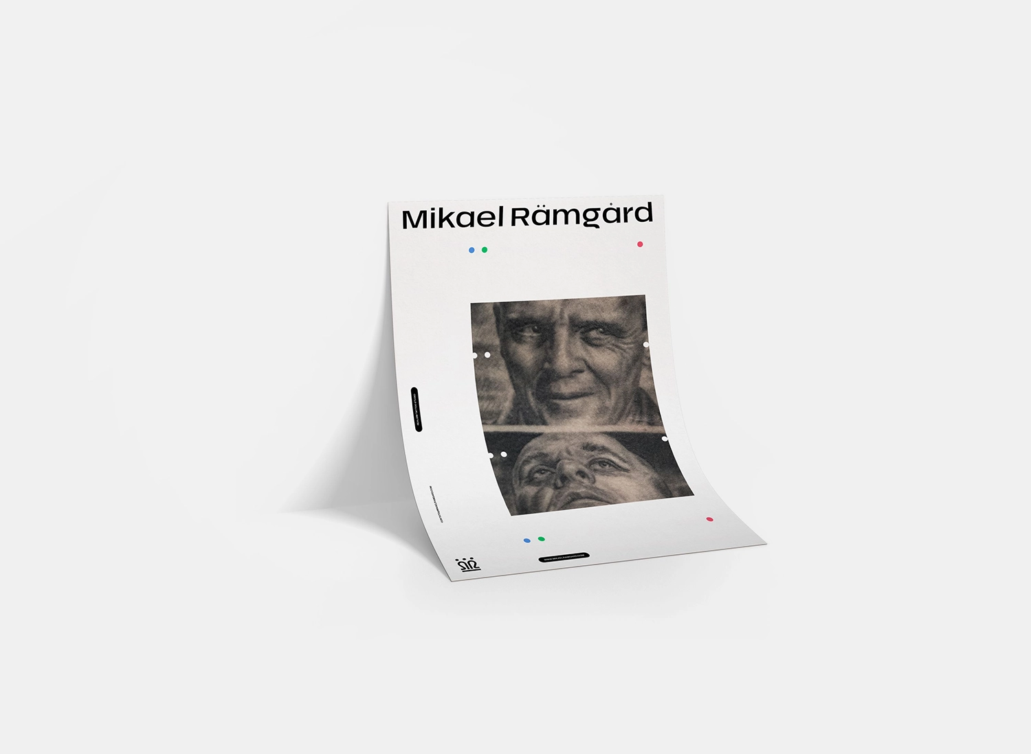
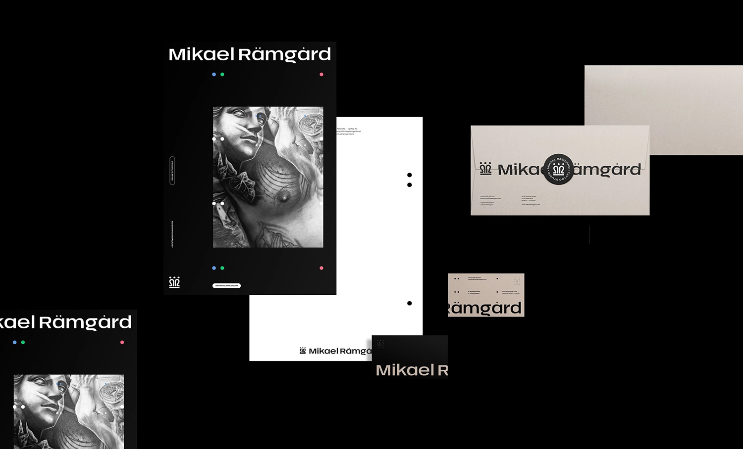
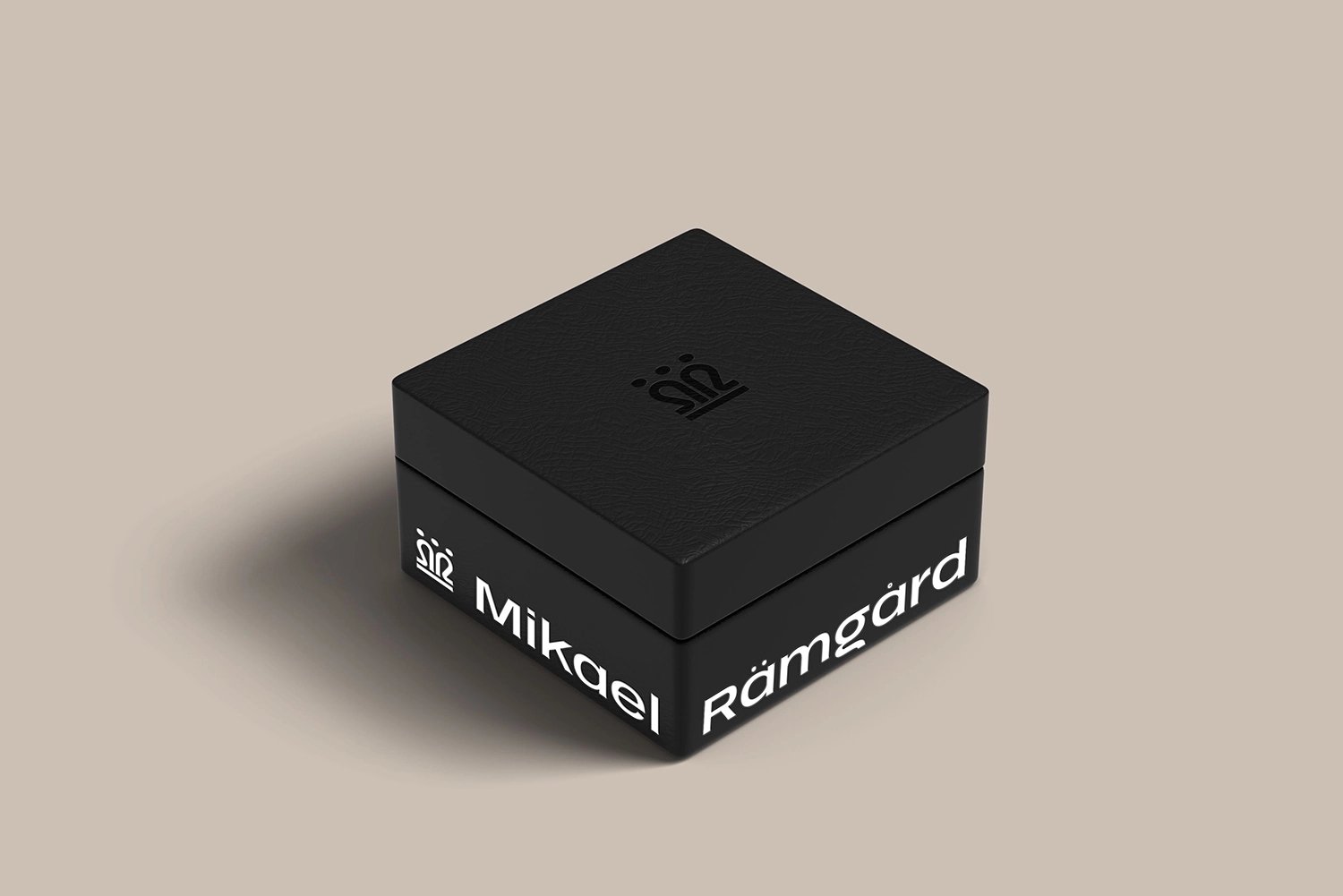
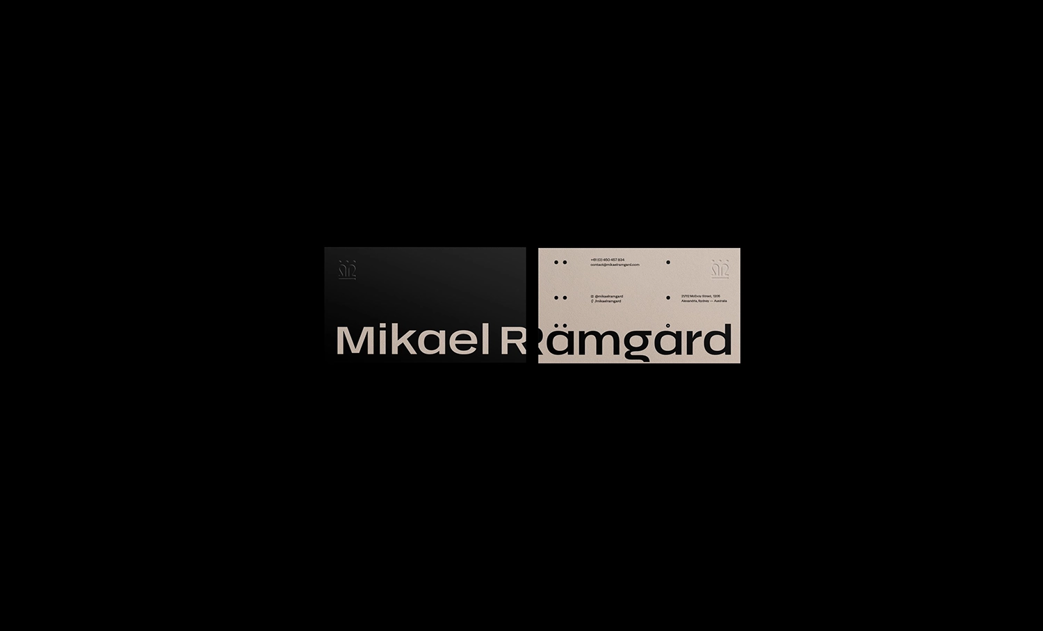
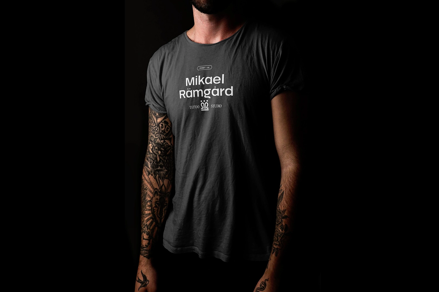
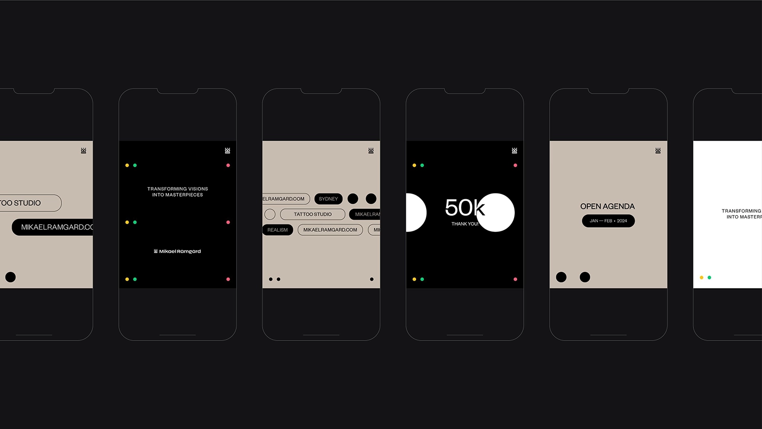
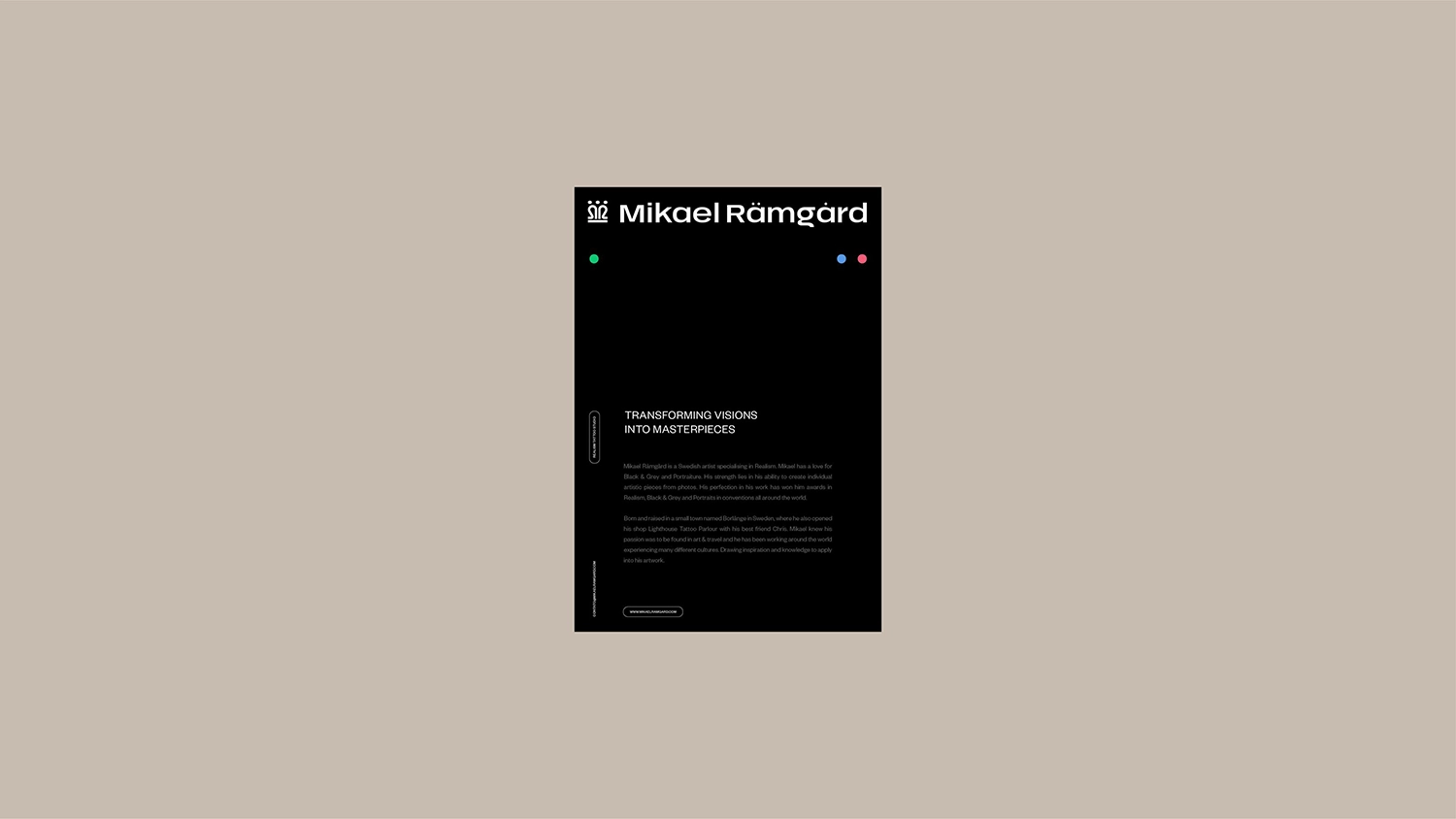
Mikael Ramgard
Sydney, Australia
Mikael Rämgård is a Swedish tattoo artist celebrated for his precision and artistry in Realism, with international recognition in black and grey, portrait, and realism categories.
While his work speaks volumes, his brand identity lacked the same level of refinement and innovation that defined his tattooing style. Our goal was to reposition Mikael as not just a master of his craft, but as a forward-thinking leader in the tattoo industry.
We addressed the disconnect between his art and his brand through a sophisticated, minimalist visual language, anchored by a clean color palette, carefully selected typography, and a logo that conveys authority, precision, and timeless style.
The final brand identity is sharp, elegant, and future-focused—seamlessly aligning with Mikael’s world-class reputation. It not only supports his growth as an artist but also positions him as a visionary shaping the next era of modern tattoo culture. Every design element, from the refined logo to the minimal visual language, works in harmony to reflect the depth and precision of his craft.
This unified aesthetic creates a lasting impression and establishes Mikael as both a creative force and a brand with enduring impact.
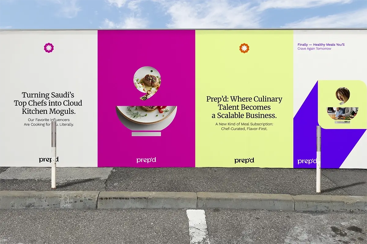
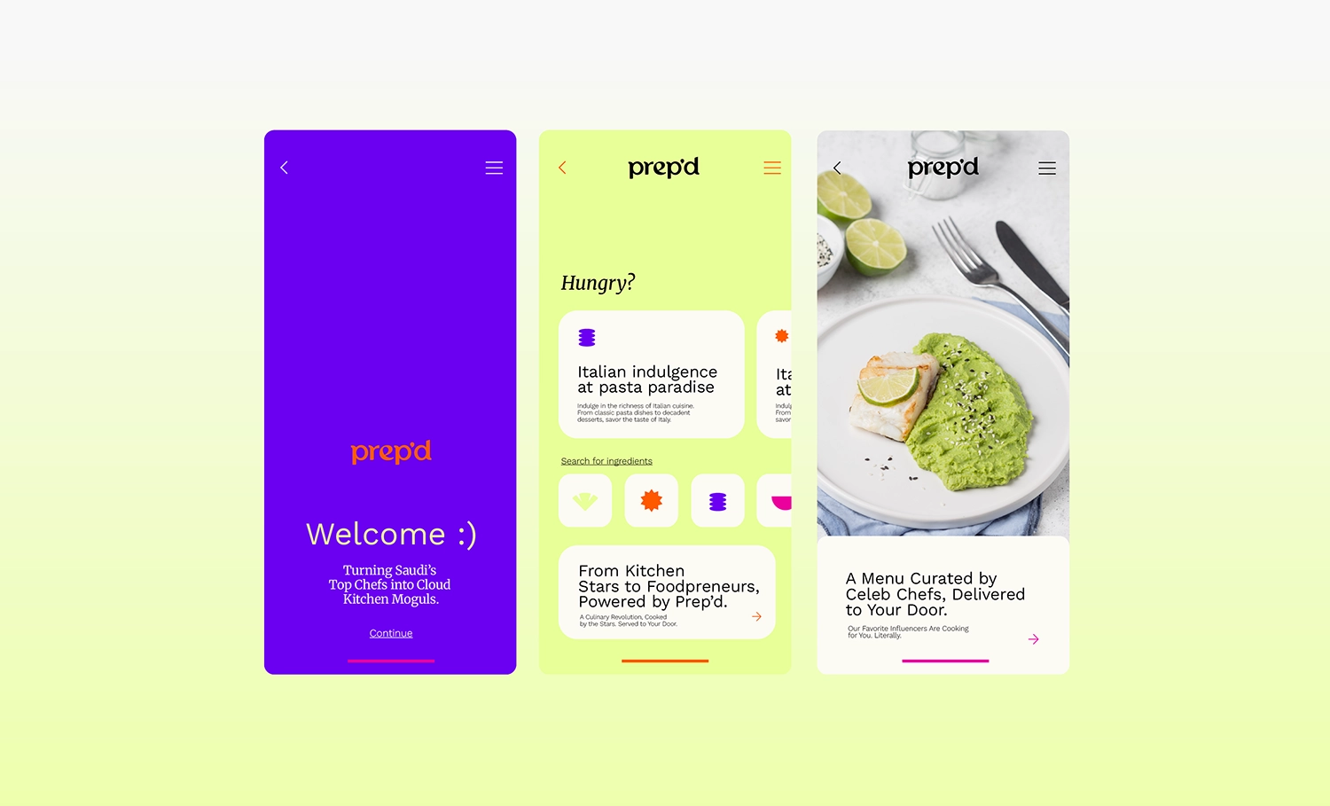

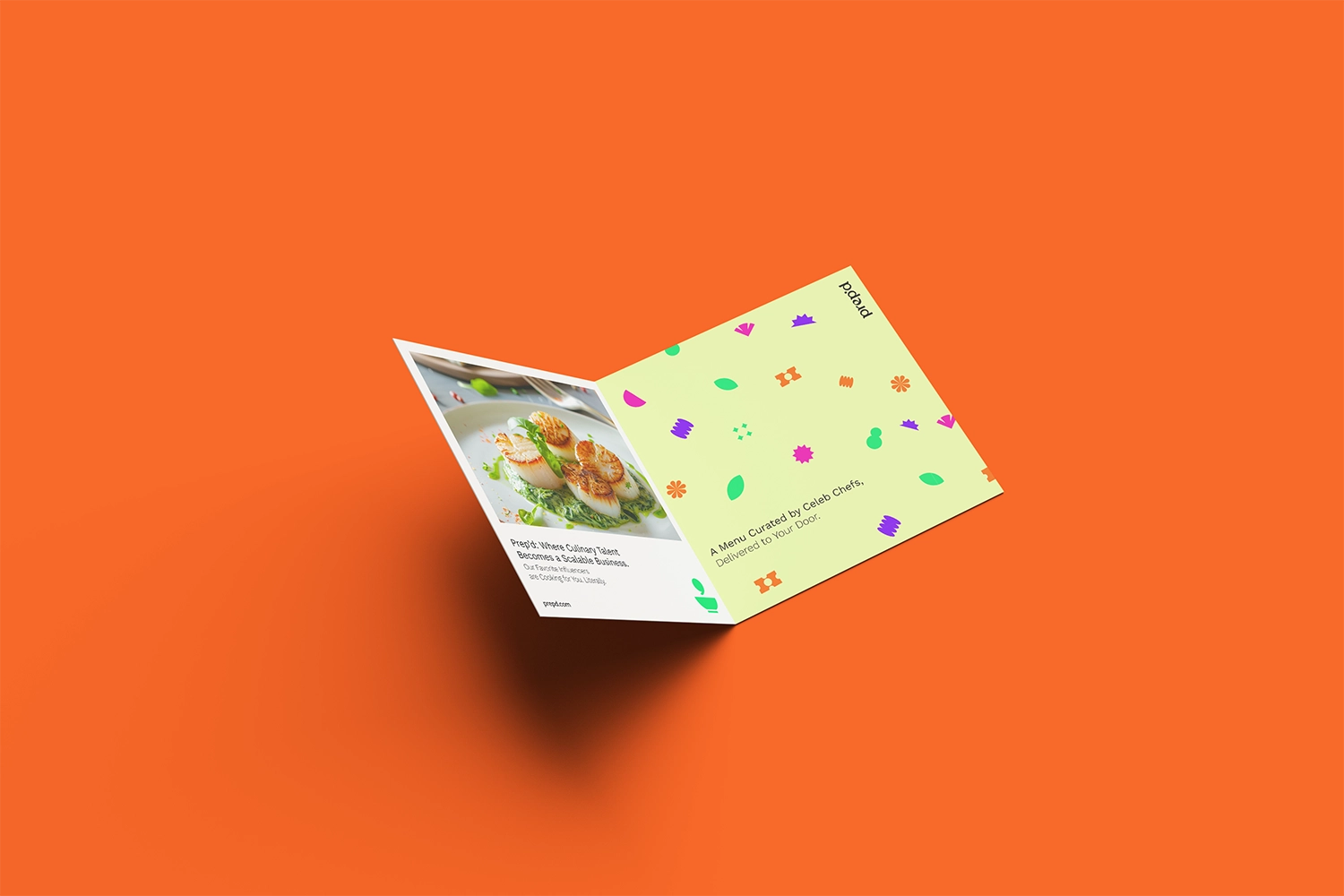
Prep'd Concept
Riyadh, Saudi Arabia
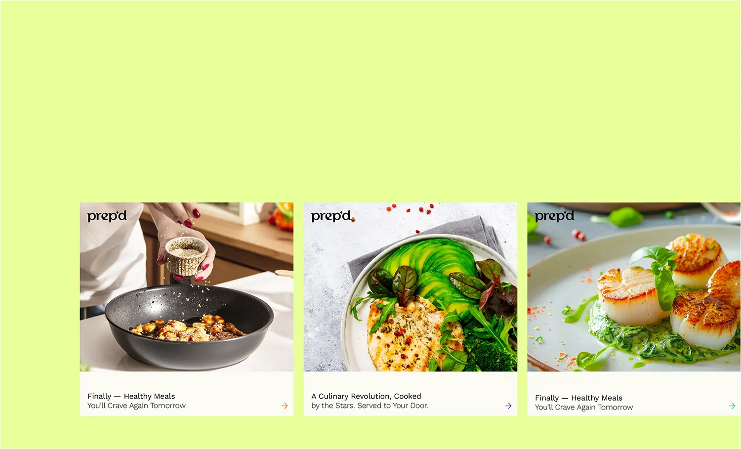
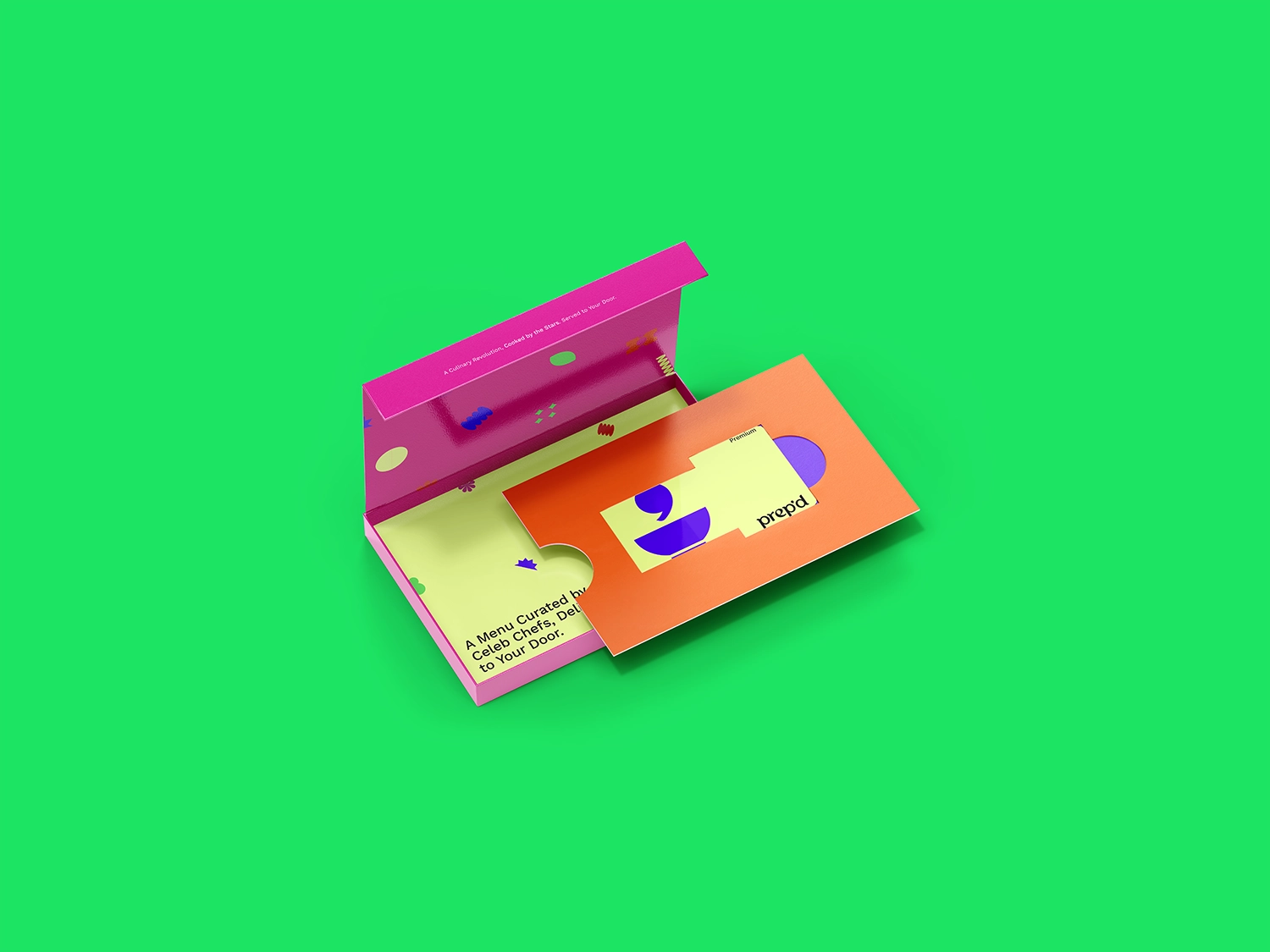
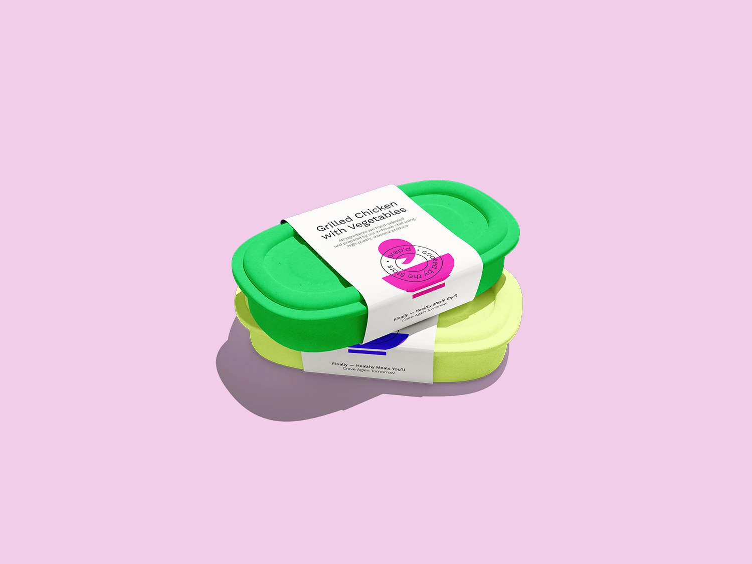
Prep’d is a culinary platform founded in Saudi Arabia with a mission to monetize culinary talent across the GCC. Launching first with a chef-driven cloud kitchen and later with Prep’d+, a subscription service focused on flavor and creativity over restrictive eating, the brand sets itself apart through vibrant storytelling and a globally inspired menu curated by top chefs and food influencers.
More than just a food provider, Prep’d delivers a personality-rich, imaginative culinary experience rooted in cultural expression.
Establishing the brand came with key challenges: balancing cheeky, unconventional branding with regional cultural sensitivity; communicating its creative, chef-led value beyond typical health-first meal plans; and clearly unifying its hybrid model of on-demand and subscription-based offerings. In a saturated food-tech market, Prep’d also had to ensure it stood out without losing clarity or trust.
To overcome these hurdles, the brand identity blends bold design, playful yet professional messaging, and consistent storytelling.
A vibrant color palette, whimsical graphics, and emotionally engaging content build recognition and trust, while curated culinary talent grounds the brand in quality and authenticity. Prep’d emerges as a confident, creative disruptor—bringing joyful, chef-led dining to the forefront of the GCC’s evolving food landscape.
Designing clarity. Empowering growth.
Profile
As the founder and lead of AMca, Andrea Moitinho brings over 25 years of international experience as a Creative Director and Brand Strategist, partnering with businesses across the globe to create brand work that is both strategically grounded and visually refined. Based in Europe and working globally, Andrea supports teams in scaling their creative capabilities, elevating their output, and building brand systems designed for long-term relevance and scalable growth.
Recognized for her ability to distill complexity into clarity, Andrea specializes in creating brand value through visual languages that are intelligent, intentional, and built to endure. Her expertise spans brand strategy, identity systems, UX/UI design, high-level marketing collateral, templated systems, and data visualization, offering strategic, design-led support that empowers internal teams while preserving both creative integrity and long-term vision.
Her design philosophy is rooted in the principles of Swiss and Bauhaus design, fusing clarity, minimalism, and bold visual expression. The result is work that is functional yet striking, built on a foundation of purpose, system thinking, and creative restraint. Every project is approached with thoughtful simplicity and an unwavering attention to detail, hallmarks that define her aesthetic and strategic discipline.
Andrea’s global career spans APAC, Brazil, Europe, North America, and the Middle East, shaped by over 25 years of living and working across continents and collaborating with both emerging startups and established global enterprises. Having immersed herself in diverse cultural and business environments firsthand, she brings a uniquely informed perspective to every project. This breadth of experience has given her a nuanced understanding of how brands behave across different markets, enabling a design approach that is both strategically grounded and culturally attuned. Her international lens allows her to craft solutions that resonate globally while remaining agile, context-aware, and responsive in an ever-evolving business landscape.
At the core of Andrea’s practice is a belief that branding is more than visual identity, it’s the strategic foundation of how businesses communicate, differentiate, and grow. She views creativity as the driving force behind meaningful innovation and commercial success.

Client Experience (among others)
.svg)


.svg)
%201.svg)
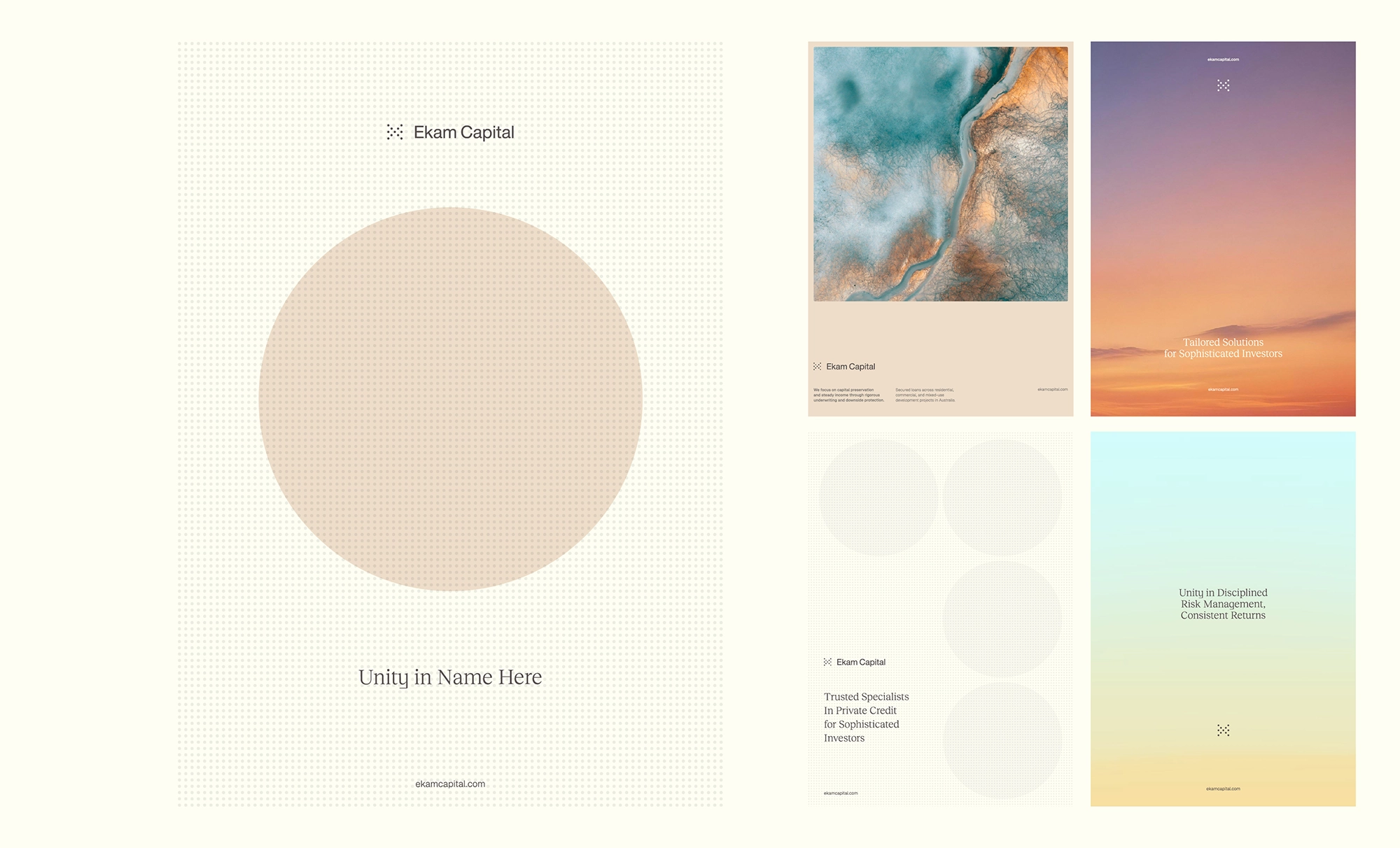
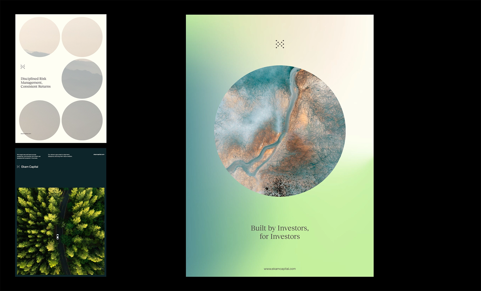
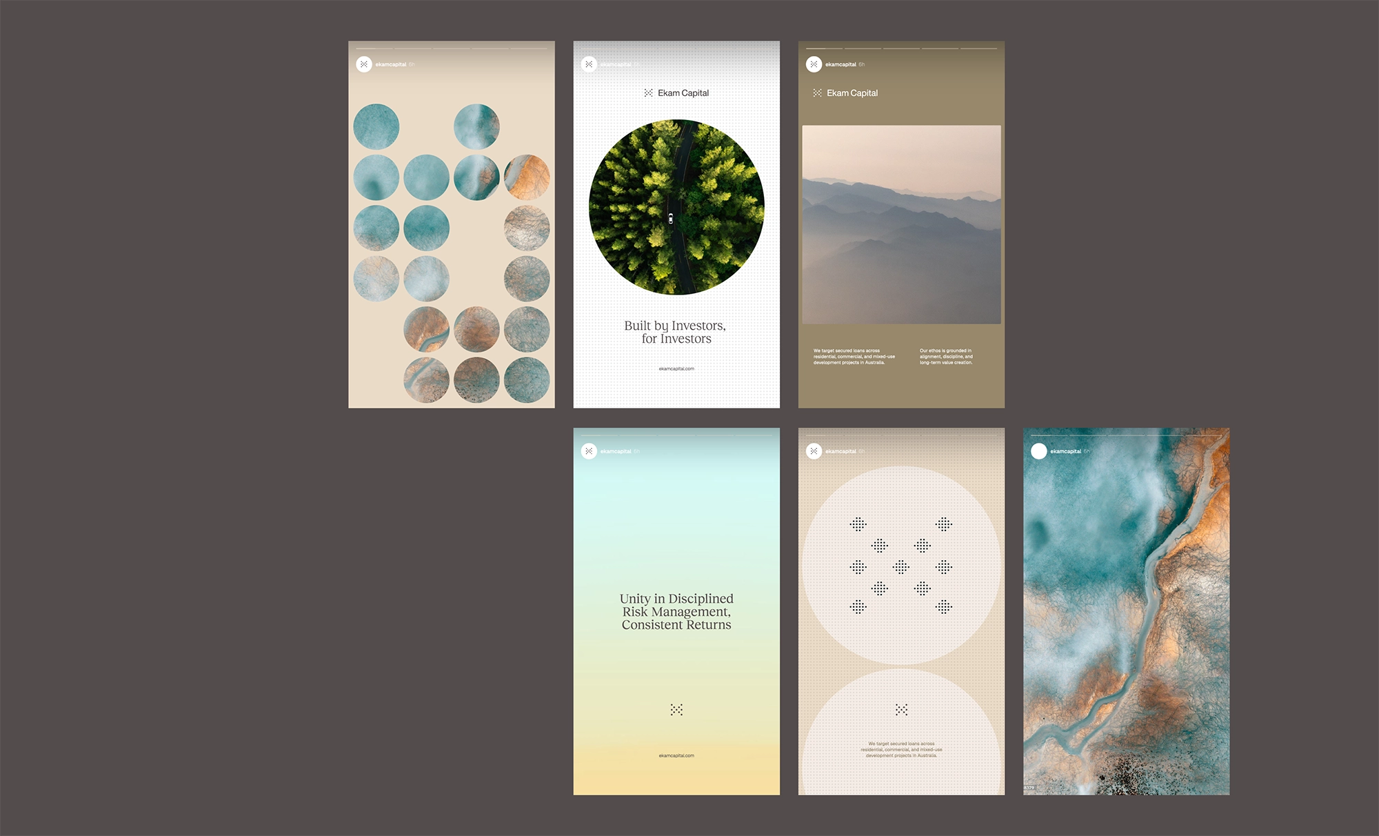
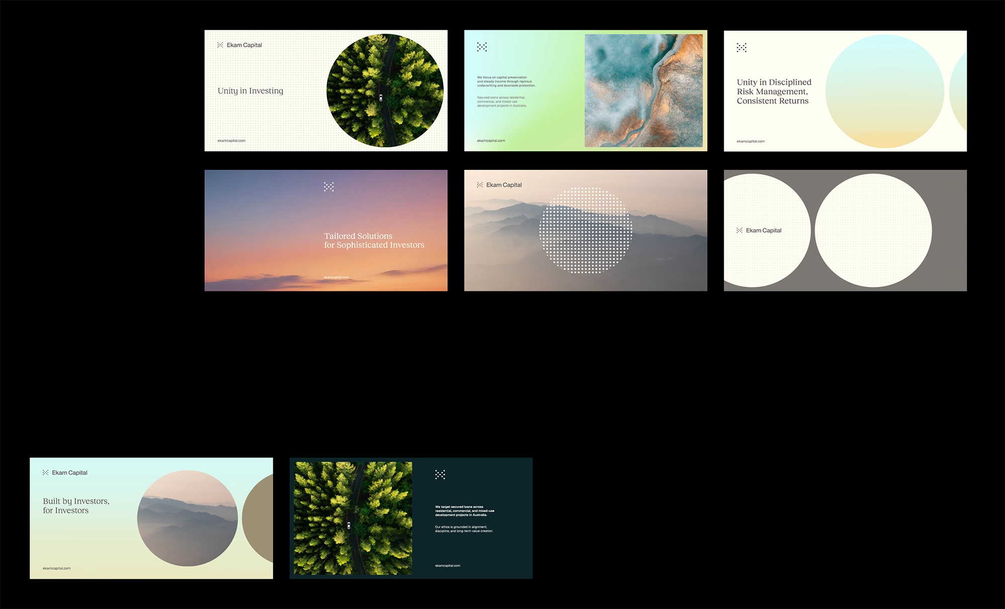
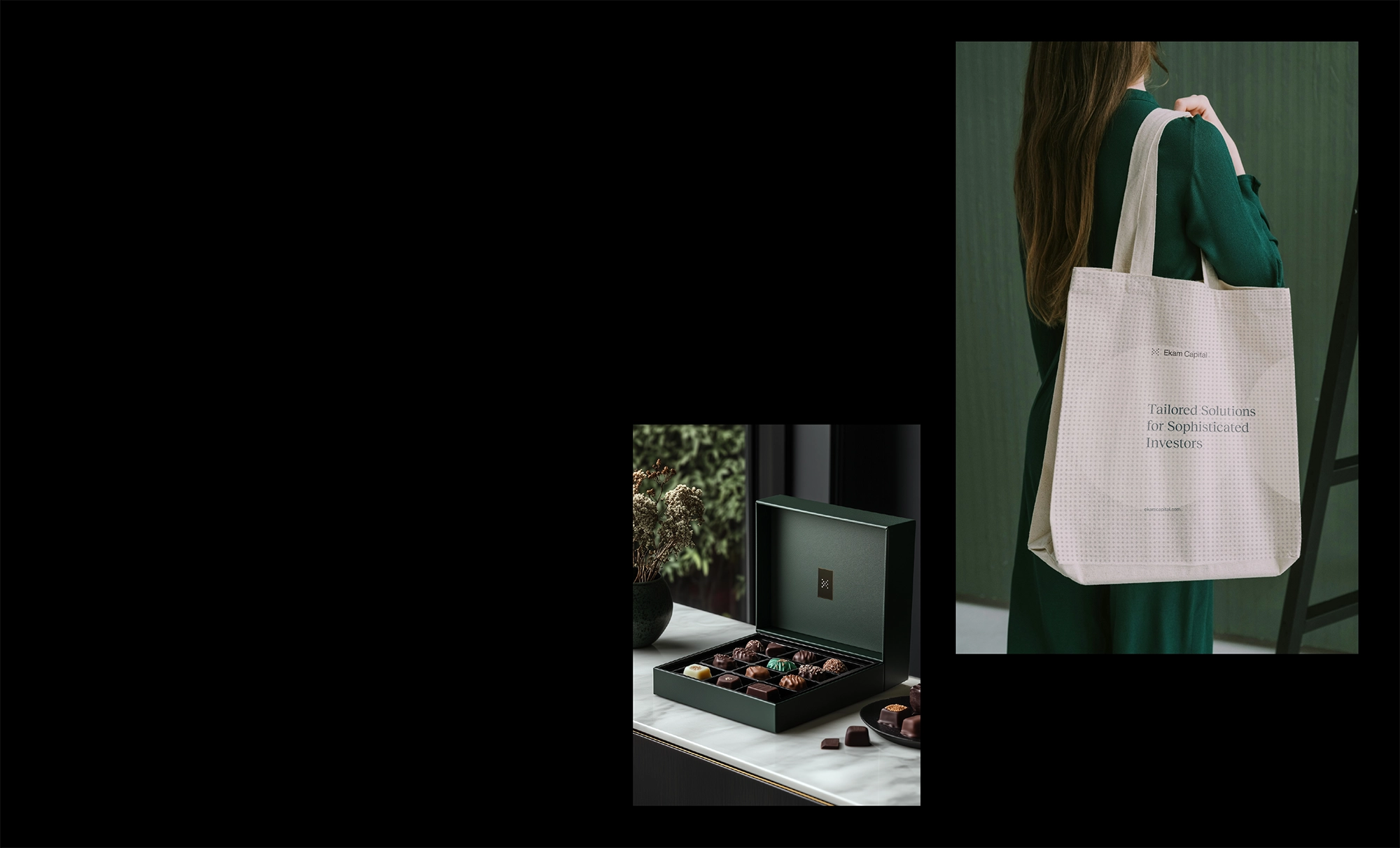
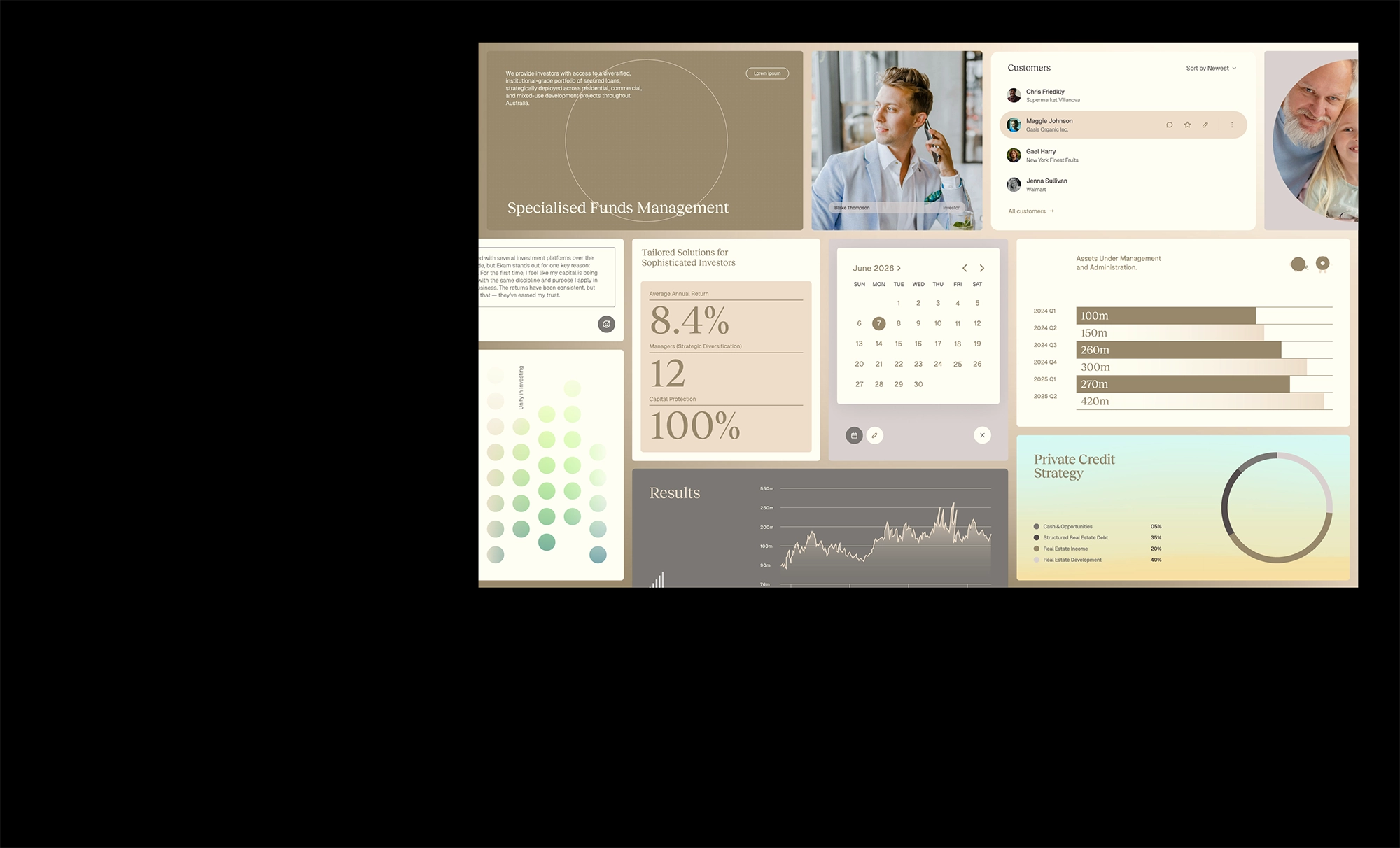
Ekam
Melbourne, Australia
Ekam Capital is a specialist funds management firm focused on private real estate credit, managing institutional-grade portfolios of secured loans across residential, commercial, and mixed-use developments in Australia.
With over 400 active loans, Ekam combines disciplined risk management, strong governance, and deep credit expertise to deliver consistent income and preserve capital.
Ekam Capital’s brand identity was designed to harmonize institutional credibility with a warm, human-centered aesthetic, appealing to both financial advisers and end-investors.
Positioned as an “institutional-grade boutique,” the brand blends elegant, structured design with emotionally resonant storytelling. Its visual identity centers on small circles forming a larger whole—symbolizing unity, synergy, and collective growth—echoing the meaning of “Ekam” ("oneness" in Sanskrit).
Drawing inspiration from nature and sacred geometry, elements like the forest path, river delta, sky, and mountains reflect both practical financial values and deeper spiritual symbolism. Together, they express Ekam’s core values of trust, alignment, stability, and higher purpose—presented through refined typography, subtle patterns, and a visual language that bridges finance and intuition.
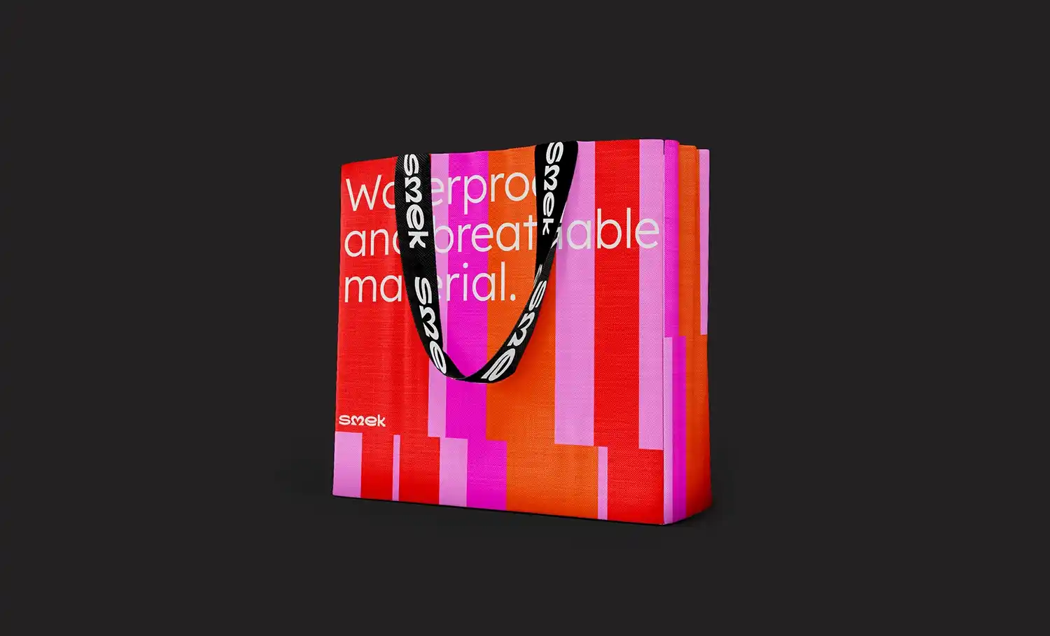
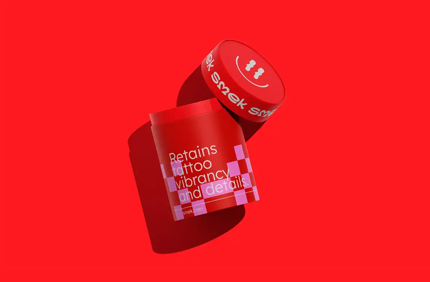
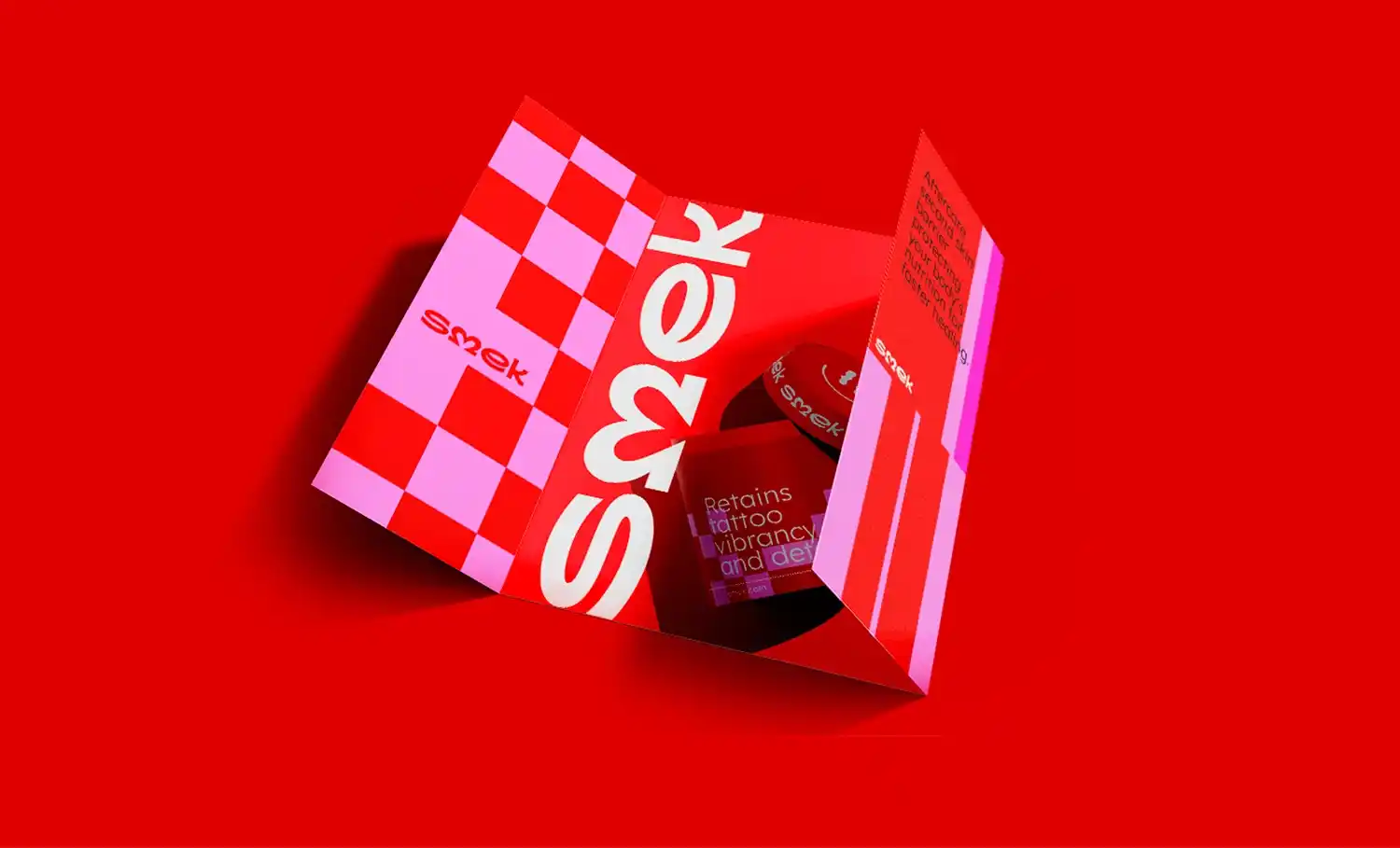
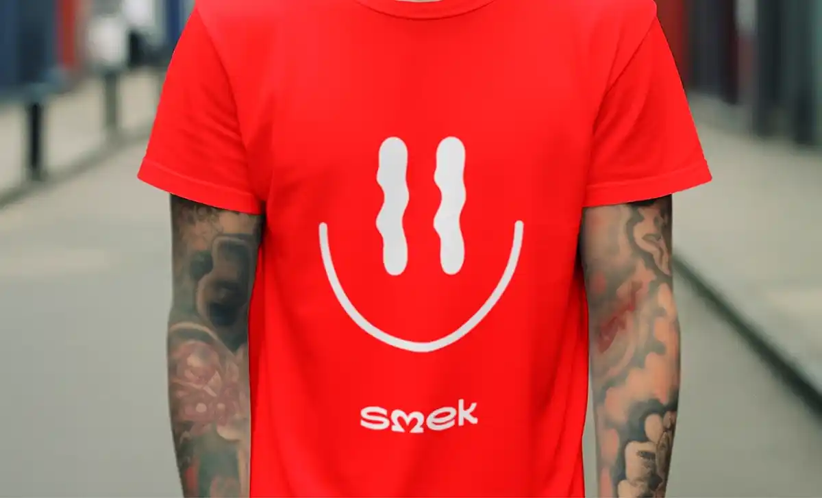
Smek
Sydney, Australia
Smek is a high-performance, second-skin tattoo aftercare solution designed to accelerate healing while preserving the colour, clarity, and detail of fresh tattoos. Its breathable and waterproof barrier protects against bacteria and infection, offering a major improvement over traditional ointments and plastic wraps.
Clinically effective and easy to use, Smek brings convenience and consistency to the aftercare process.
The core challenge in building Smek’s brand identity was finding the right balance between medical-grade trust and playful, user-friendly appeal.
The brand needed to resonate with both first-time tattoo clients and seasoned collectors, while also educating users about a new category of aftercare. In a market dominated by sterile, clinical products or overly edgy branding, Smek had to carve out a unique and approachable space.The solution was a bold and memorable identity that combines vibrant colours, clean shapes, and friendly typography.
The tone is cheeky yet safe, turning care into something unexpectedly fun and accessible. By treating tattoo aftercare as an extension of the artistic journey rather than a dull obligation, Smek presents itself as both effective and enjoyable—making healing feel as creative and expressive as the tattoo itself.

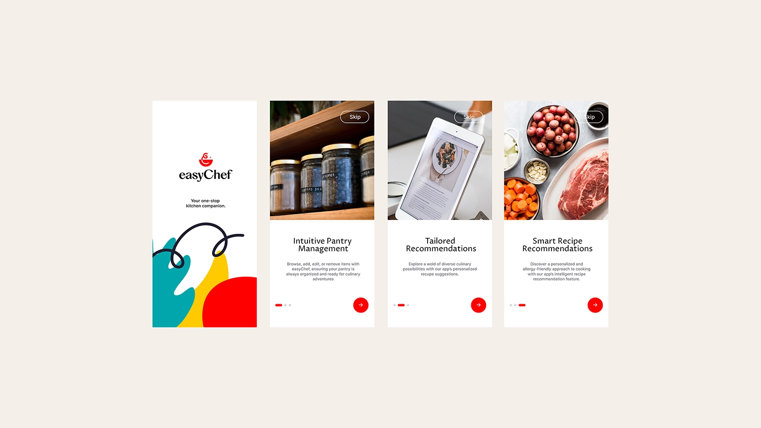
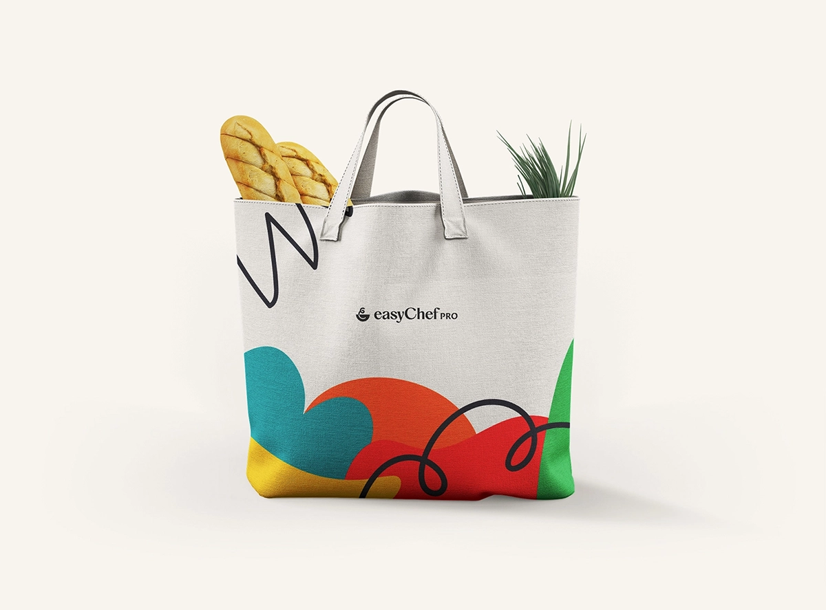
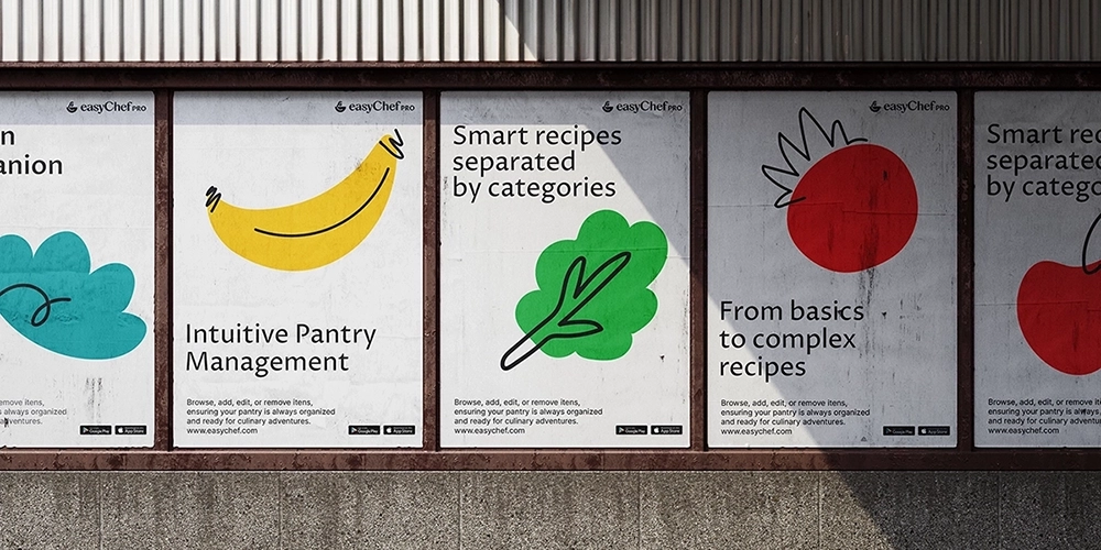
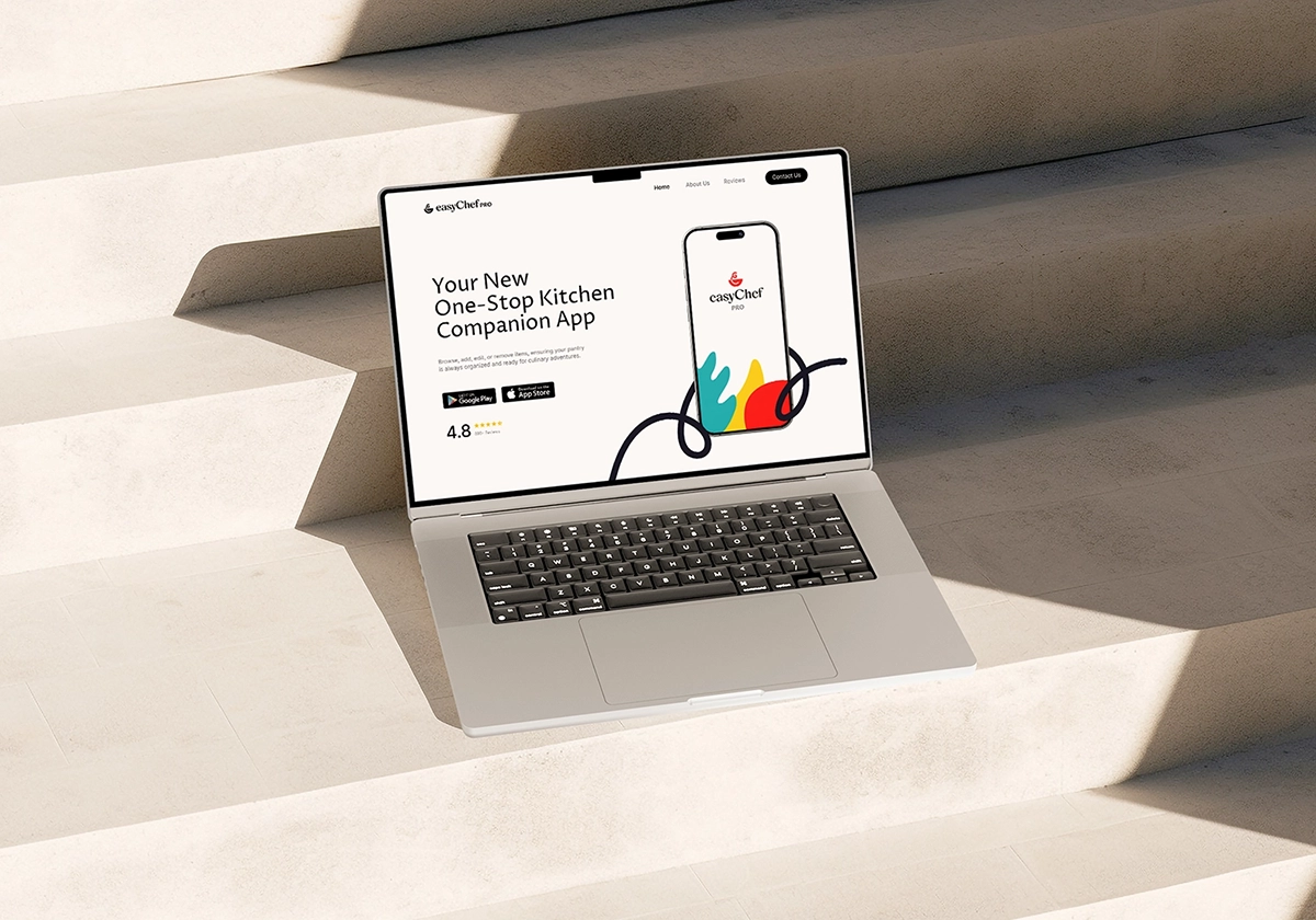
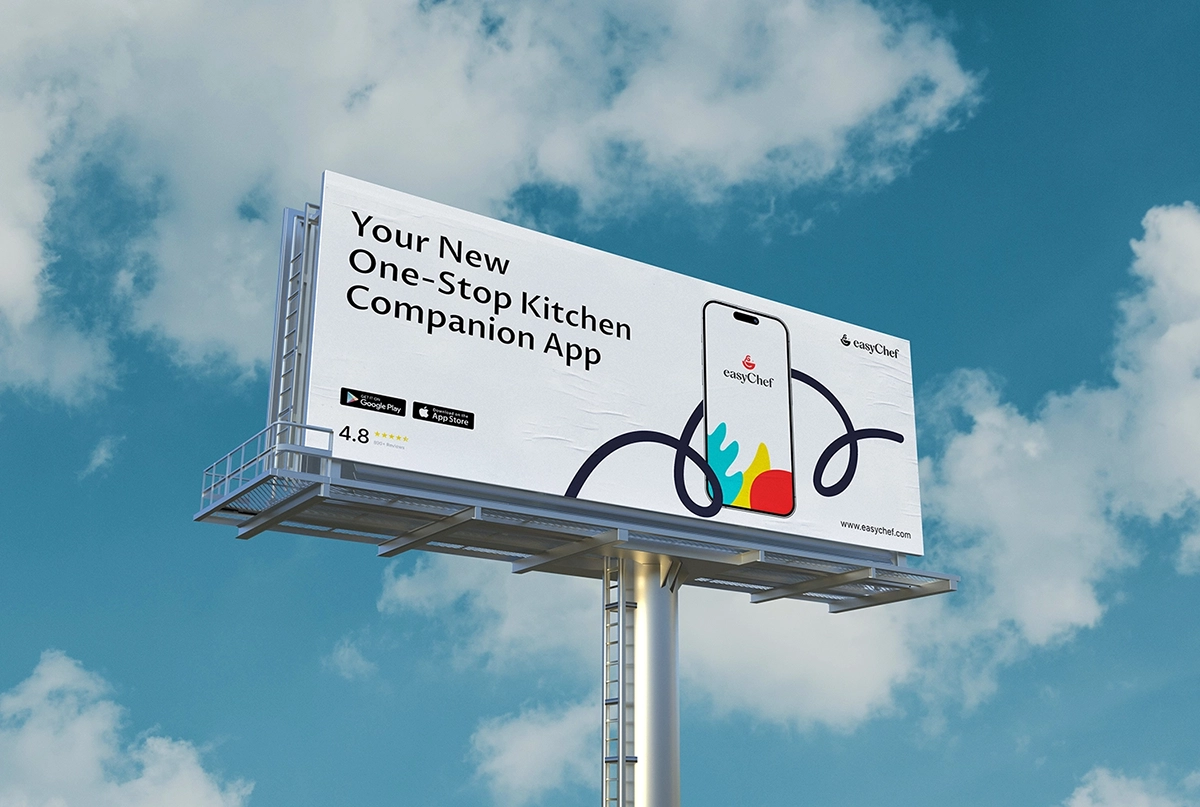
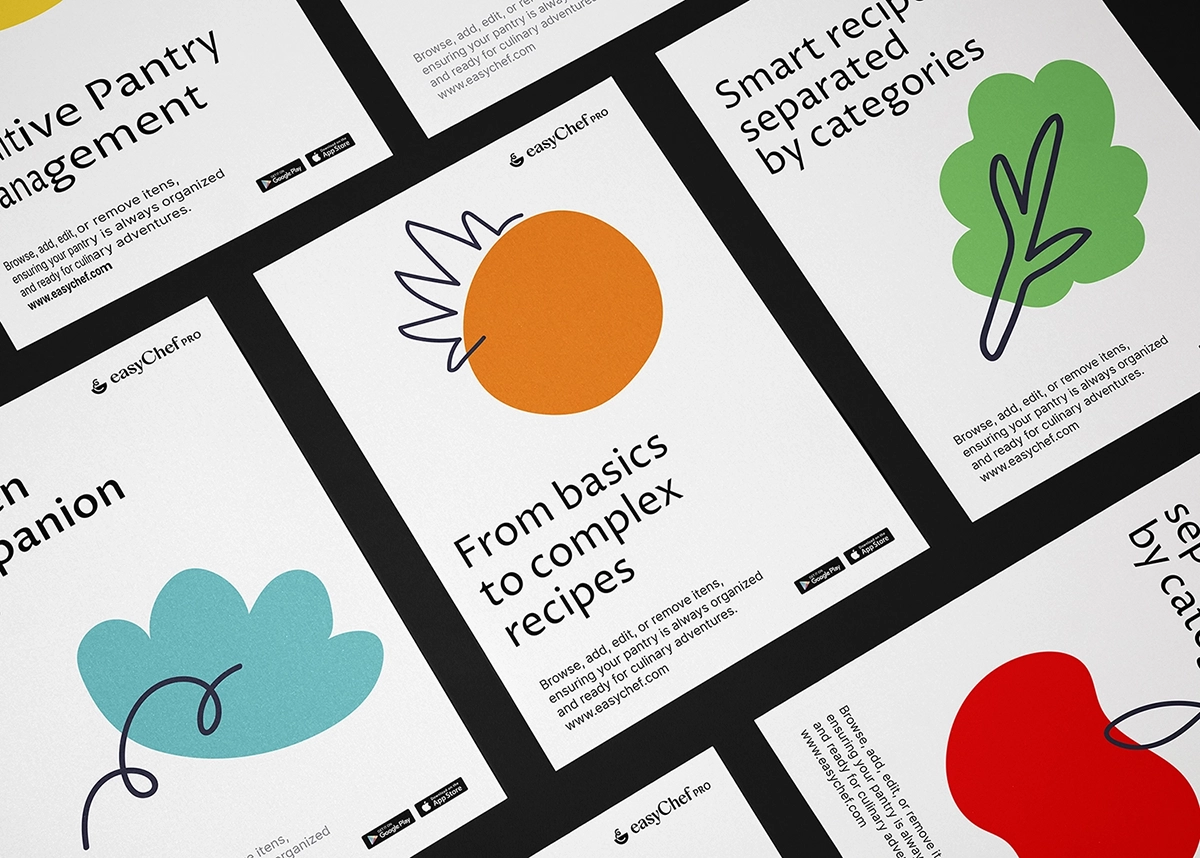
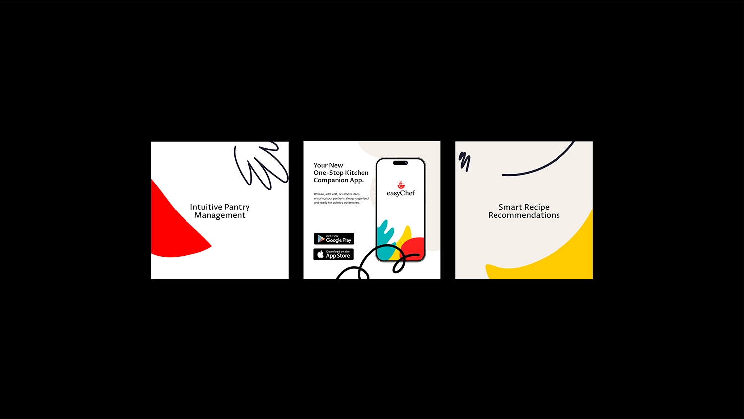
EasyChef
Nevada, USA
Step into the world of effortless cooking with Easy Chef Pro, the intuitive app that redefines the at-home kitchen experience. Designed to empower users of all skill levels, the app makes cooking approachable, enjoyable, and visually engaging.
The challenge was to create a brand identity that would reflect the app’s simplicity while also standing out in a saturated market of food and cooking apps. To solve this, we focused on a visual language that blends playfulness with clarity.
We brought the brand to life using fun, simple line tracings and charismatic shapes in motion—provoking curiosity and encouraging user interaction. A vibrant color palette against a clean white background served as the perfect foundation for animated, cheeky movements that reflect the energy and personality of the app.
These creative choices allowed us to position the brand as approachable, modern, and full of personality. The result is a bold yet accessible identity that delivers both visual delight and strategic clarity. Easy Chef Pro is now not only a functional cooking companion, but also an engaging brand that sparks joy, builds awareness, and drives user acquisition.
From playful accents to intuitive design, every element was crafted to create a fun, seamless cooking experience—transforming everyday meals into moments of creativity.
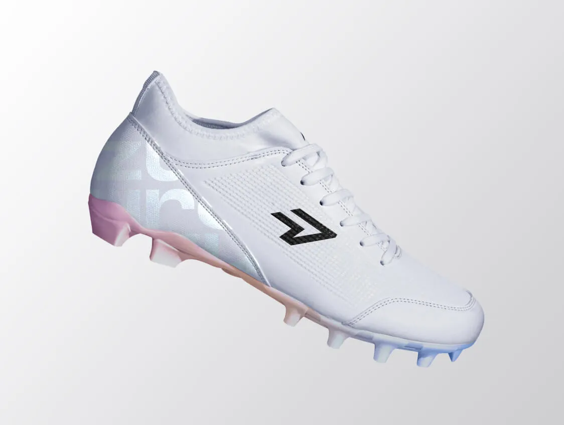
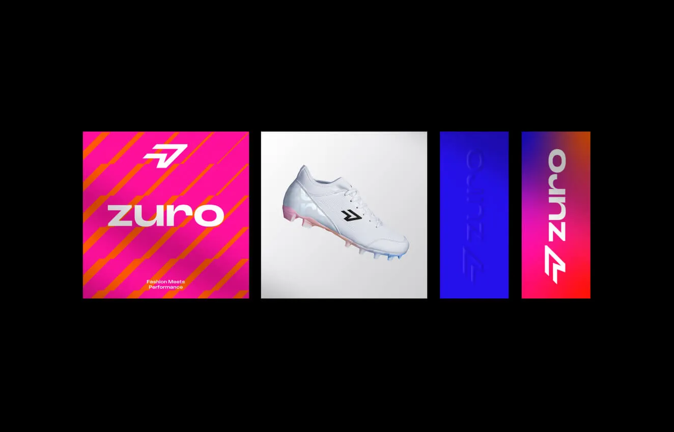
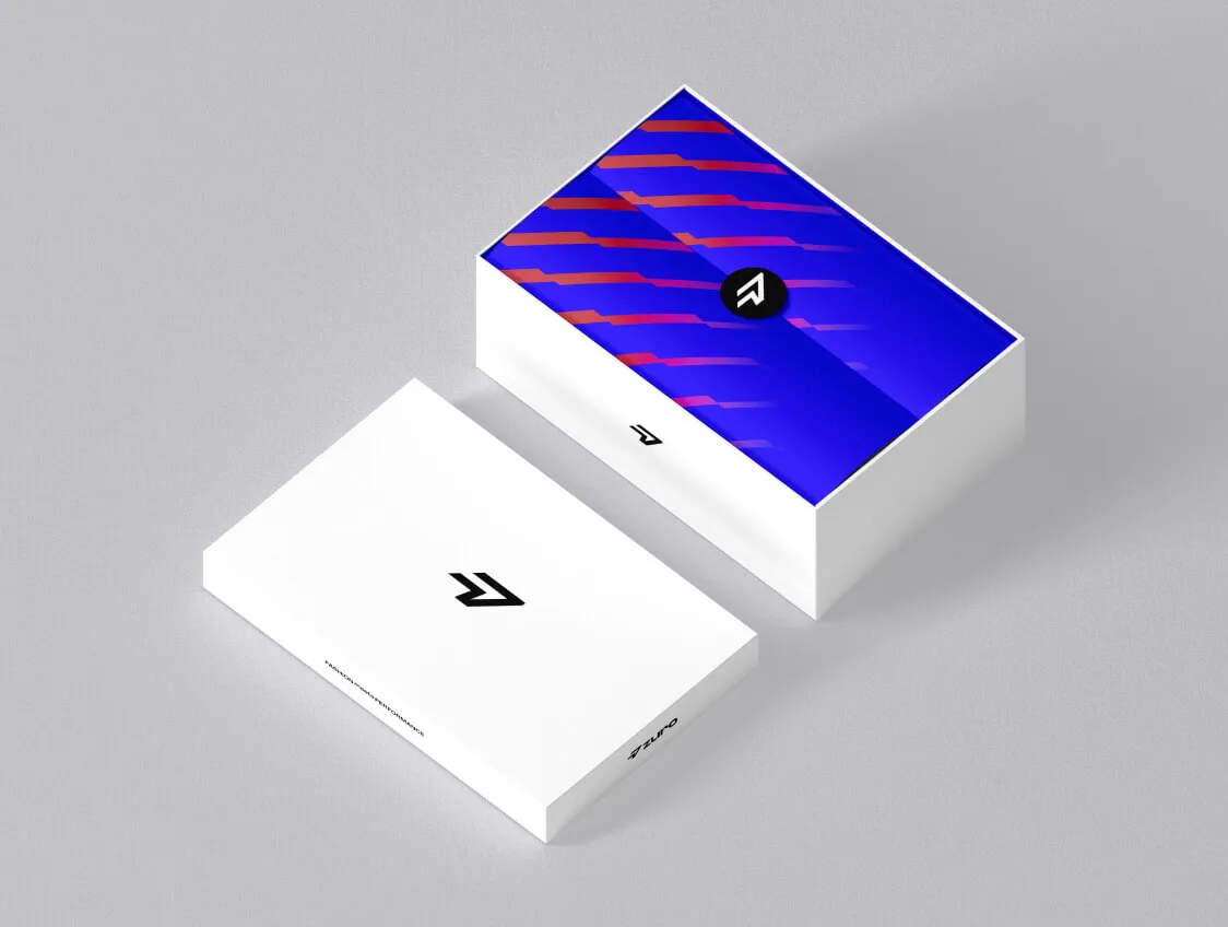
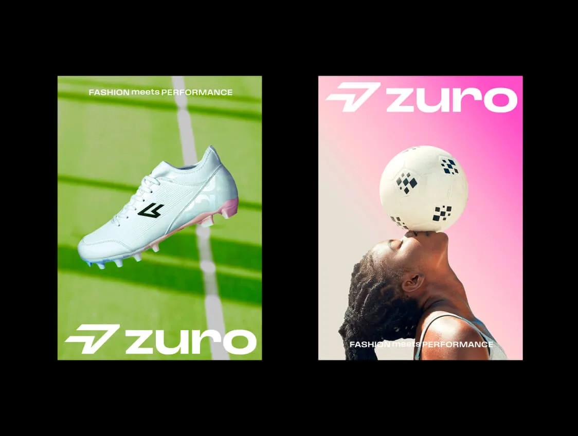
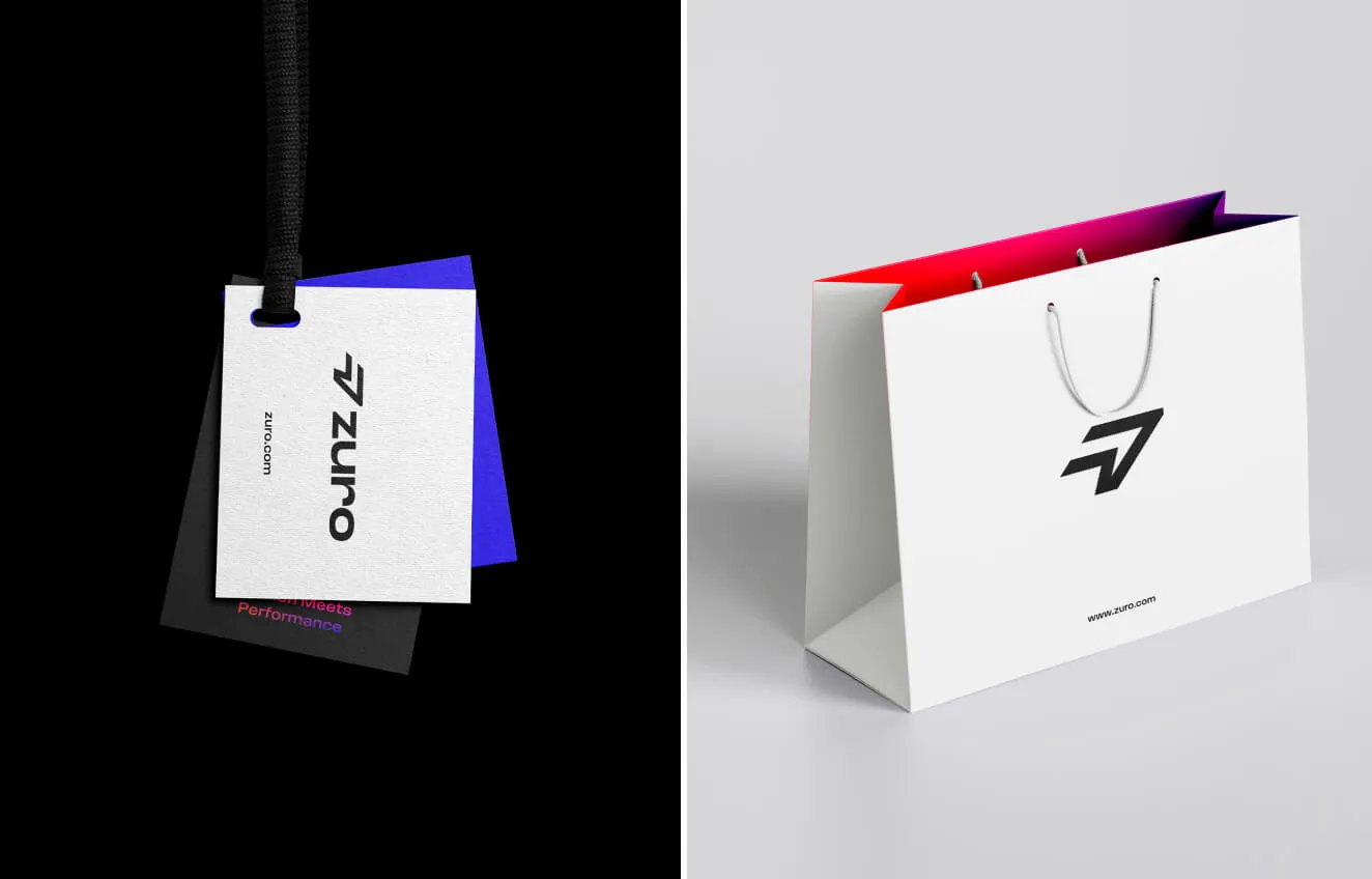
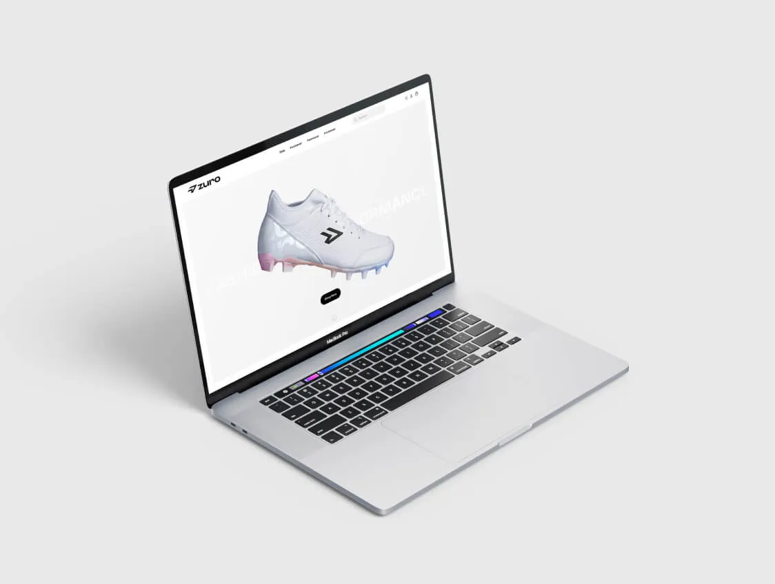

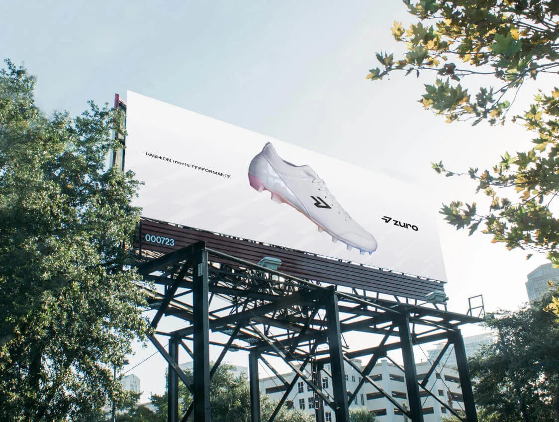
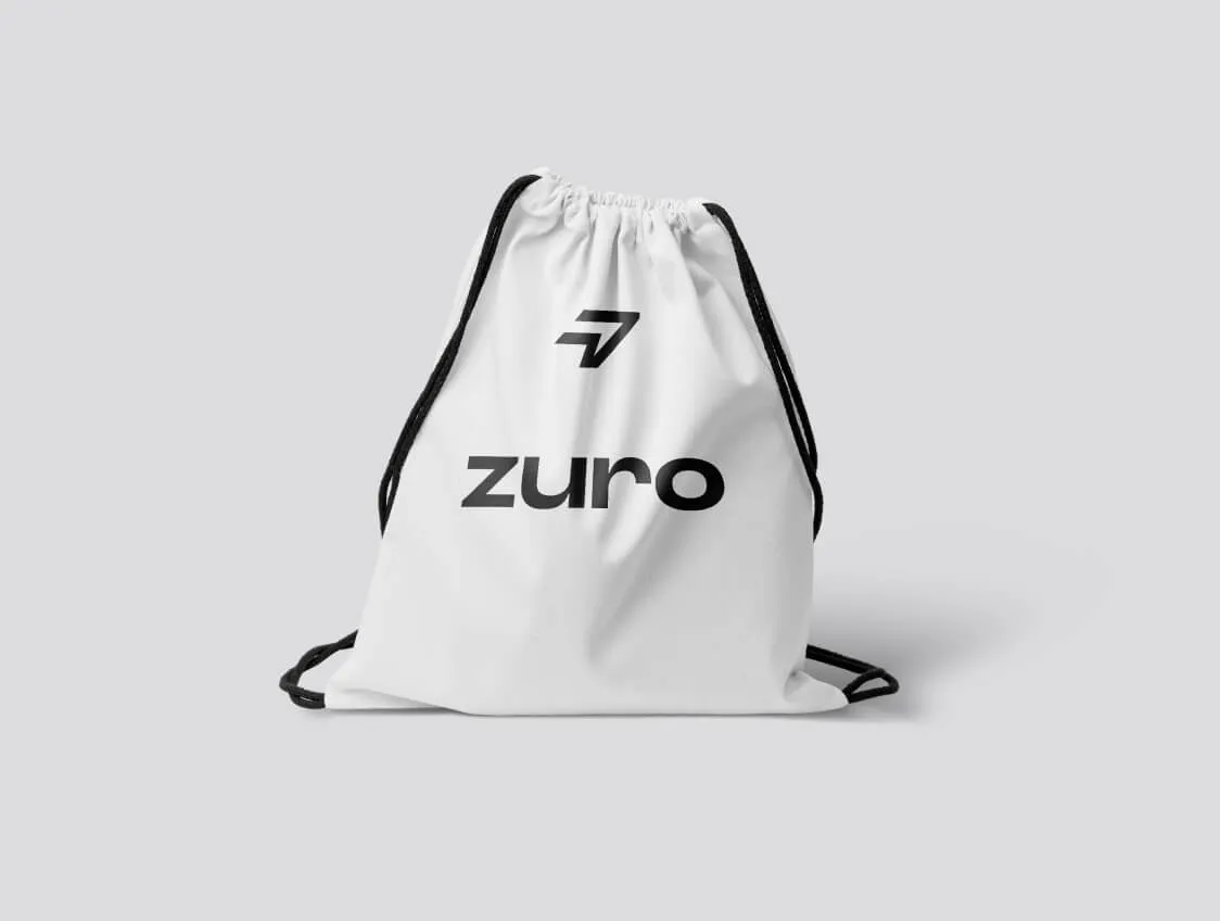
Company Name
Sydney, Australia
Zuro is a women’s sports boot brand with a mission to empower confidence and comfort for women in sports. Their vision is clear: to encourage more women to participate in athletic activities and support the development of the female athletes of tomorrow.
The challenge was to create a brand identity that spoke not to fashion elitism, but to real women, athletes, learners, and dreamers, who value authenticity, strength, and approachability in the sports space. Our primary goal was to move away from the typical, polished high-fashion narrative often seen in female athletic wear. Instead, we positioned the brand around values of inclusivity, energy, and playful strength.
This required us to craft a visual language that could communicate empowerment without being aggressive, and charm without being overly delicate. By using bold yet inviting design elements, we aimed to create a brand that resonates emotionally and visually with active, ambitious women.
The final identity came to life through animated playful motions, colorful patterns, and a soft, welcoming gradient—creating a brand that feels both energetic and approachable.
These visual tools allowed Zuro to stand out in a traditionally male-dominated and often overly serious market. The result is a memorable, expressive brand that celebrates movement, self-expression, and the joy of sport, while reinforcing Zuro’s purpose of shaping the next generation of female athletes.